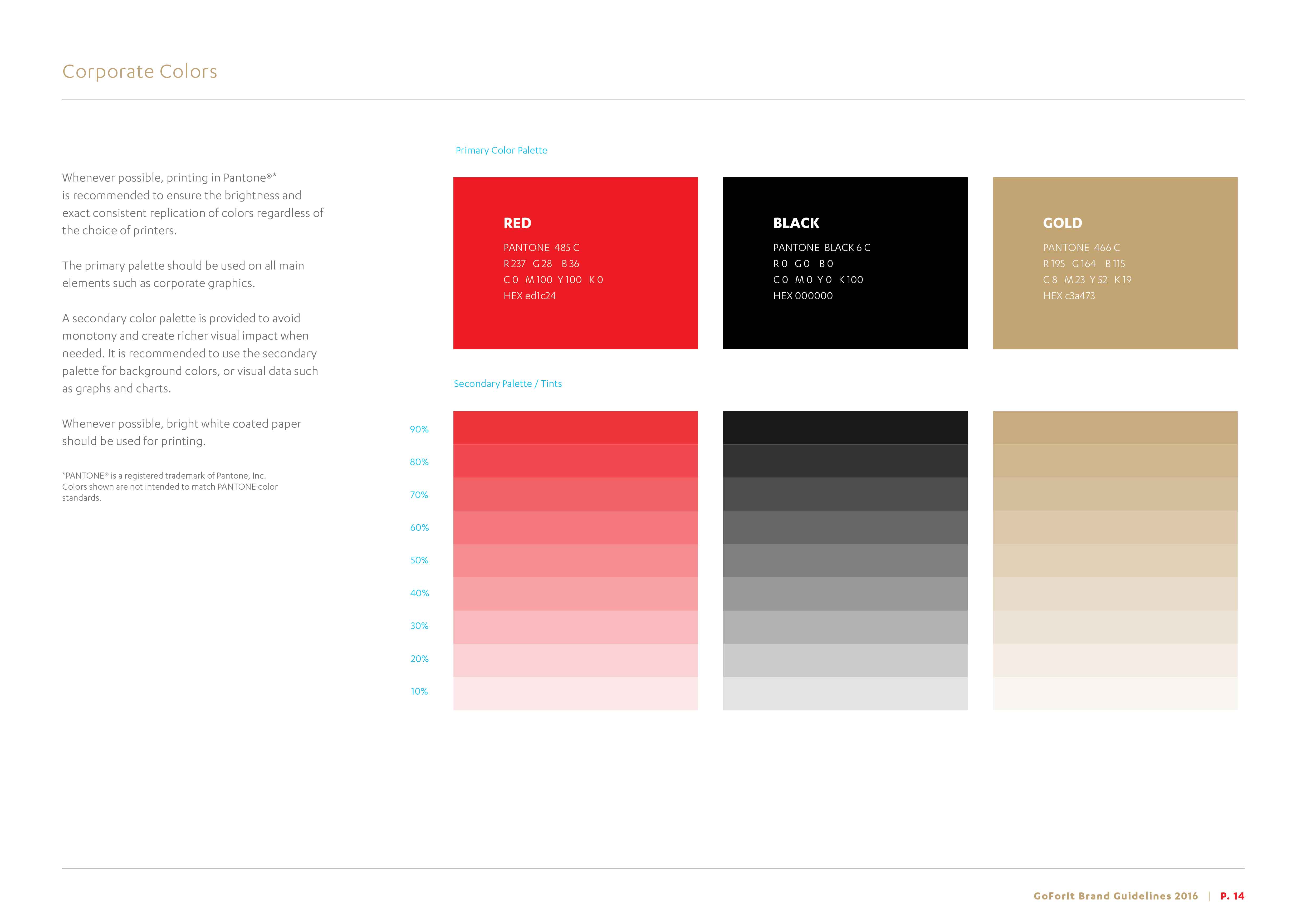
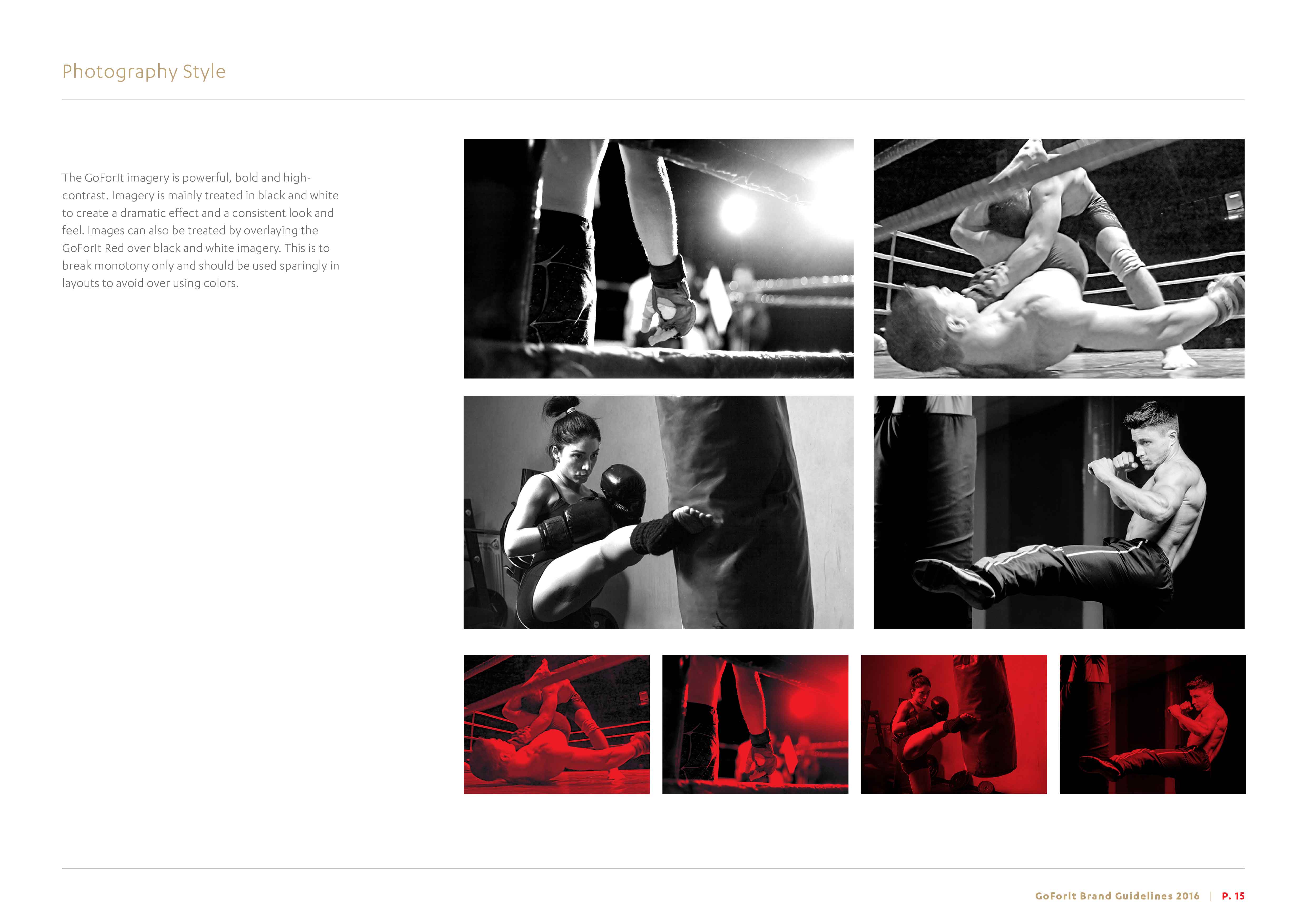
GoForIt
Work done for Branding For The PeopleDesign | Branding | Logo Design
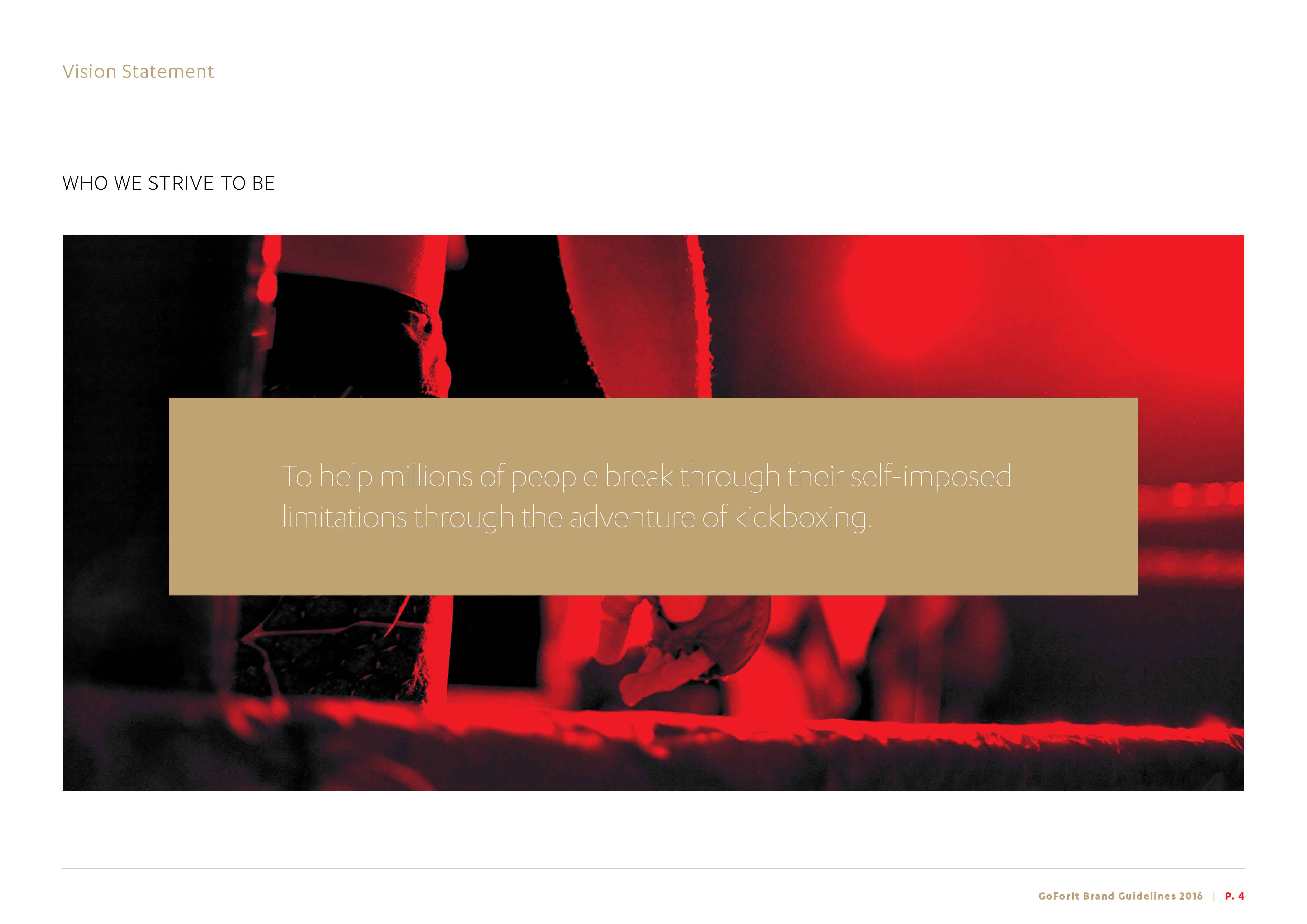
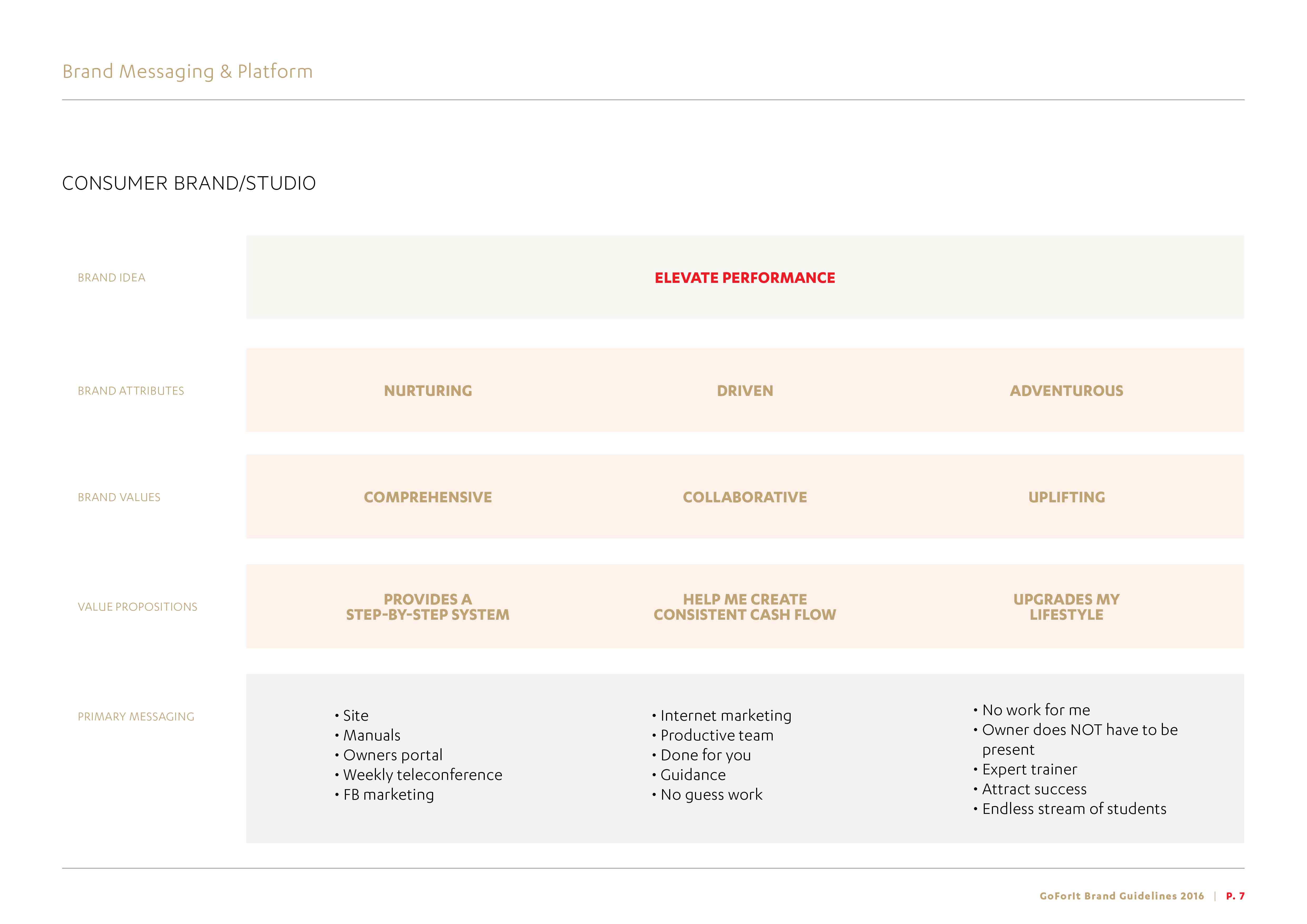
GoForIt is a kickboxing franchise based in the US that aims to provide fitness entrepreneurs with a System Driven Business they can be passionate about and make a great living doing it. The brand is all about increasing performance, with brand attributes suggesting the brand was driven, collaborative, and adventurous.
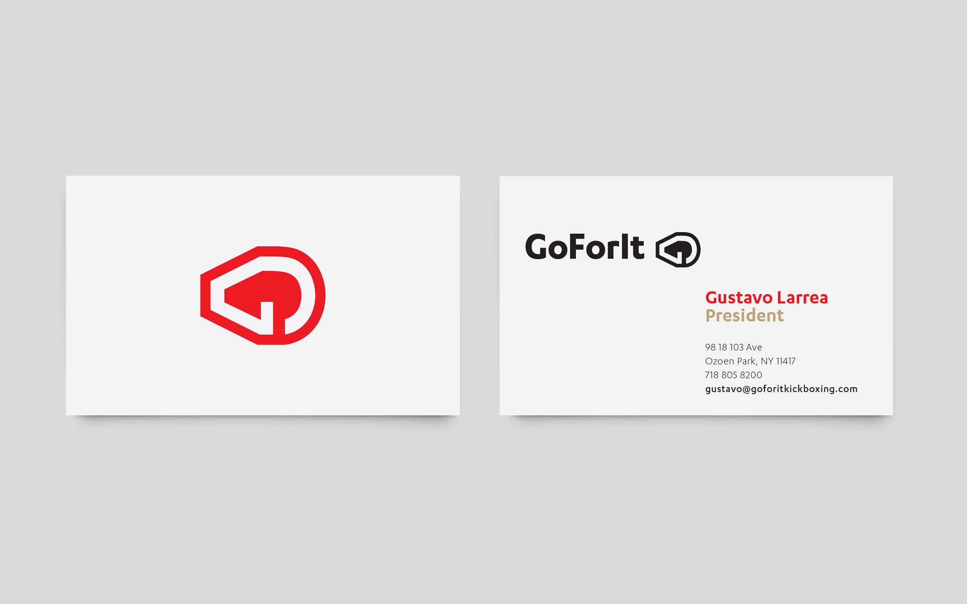
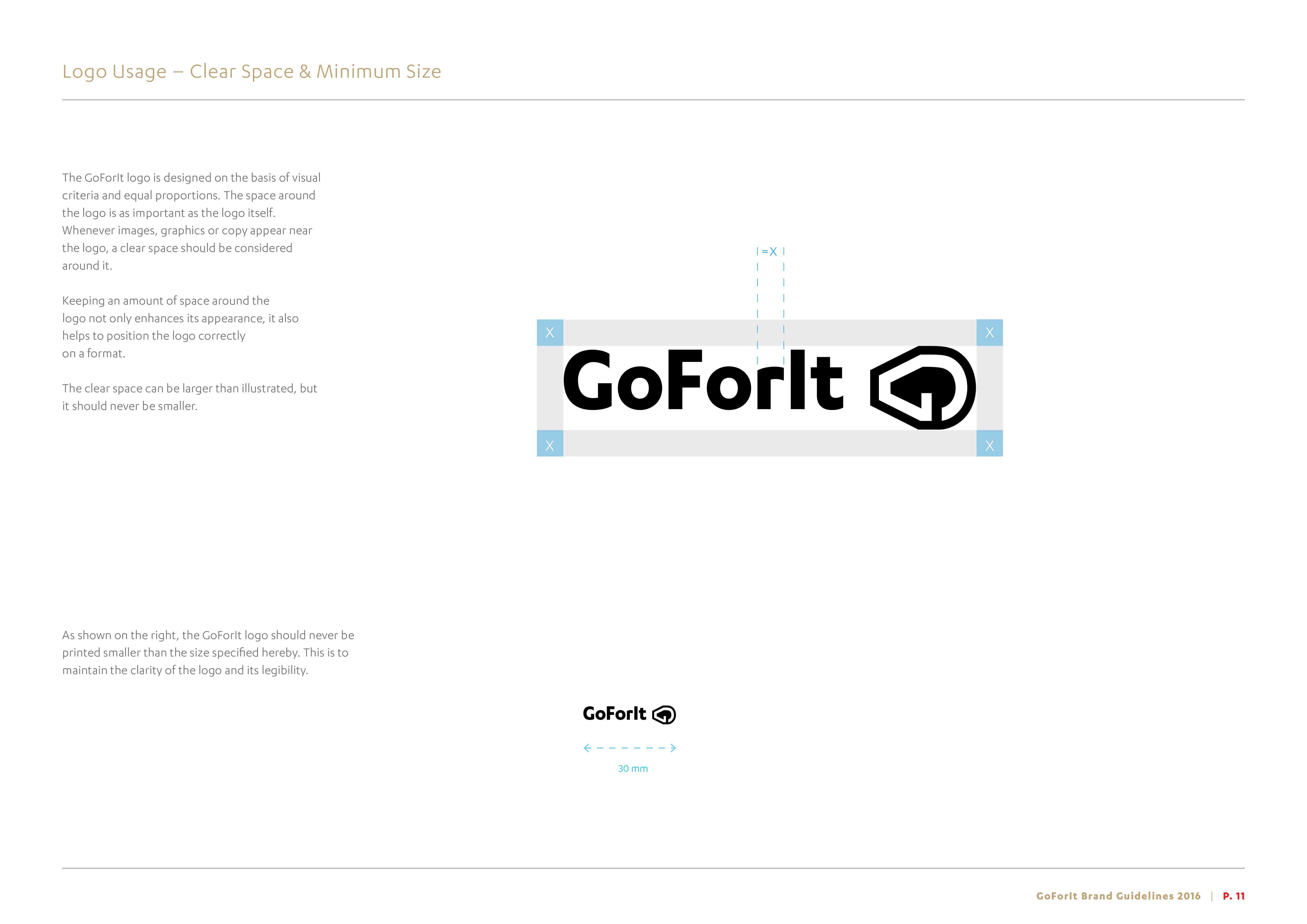
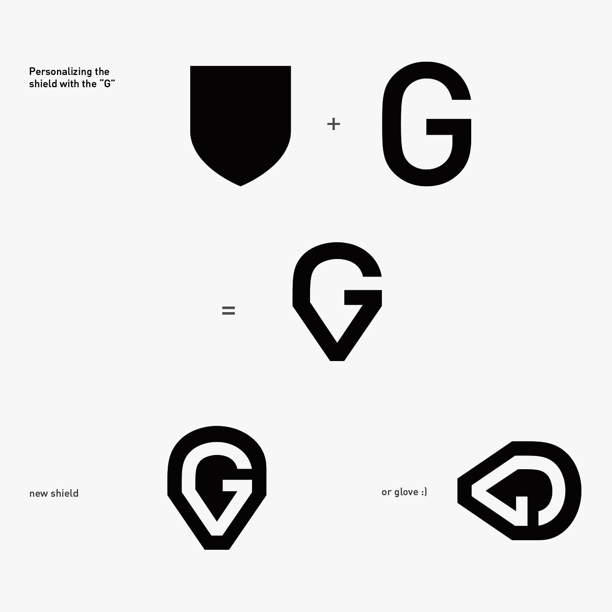
The logo needed to be reminiscent of high-intensity sports, and convey strength and drive. This was achieved by exploring the similarities of shapes between the “G” and the typical sports emblem form, to create an abstract boxing glove. The result was a bold, dynamic, own-able symbol that communicated both the business and the attitude of the brand.
Moodboard

Design rationale and logo
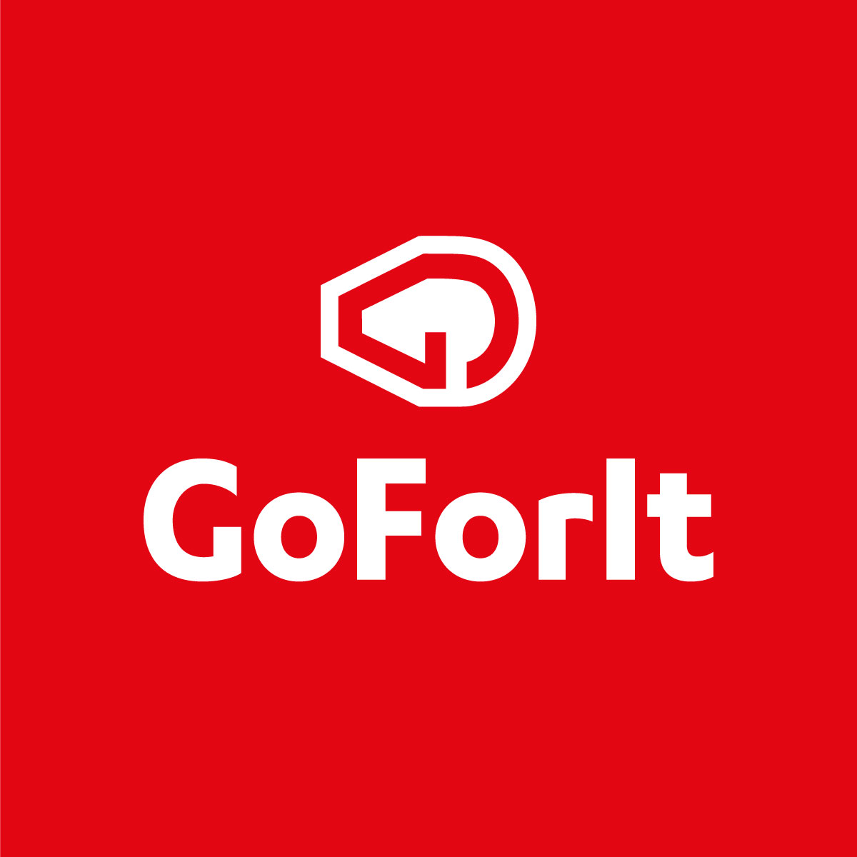
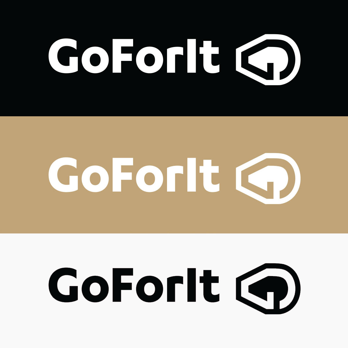
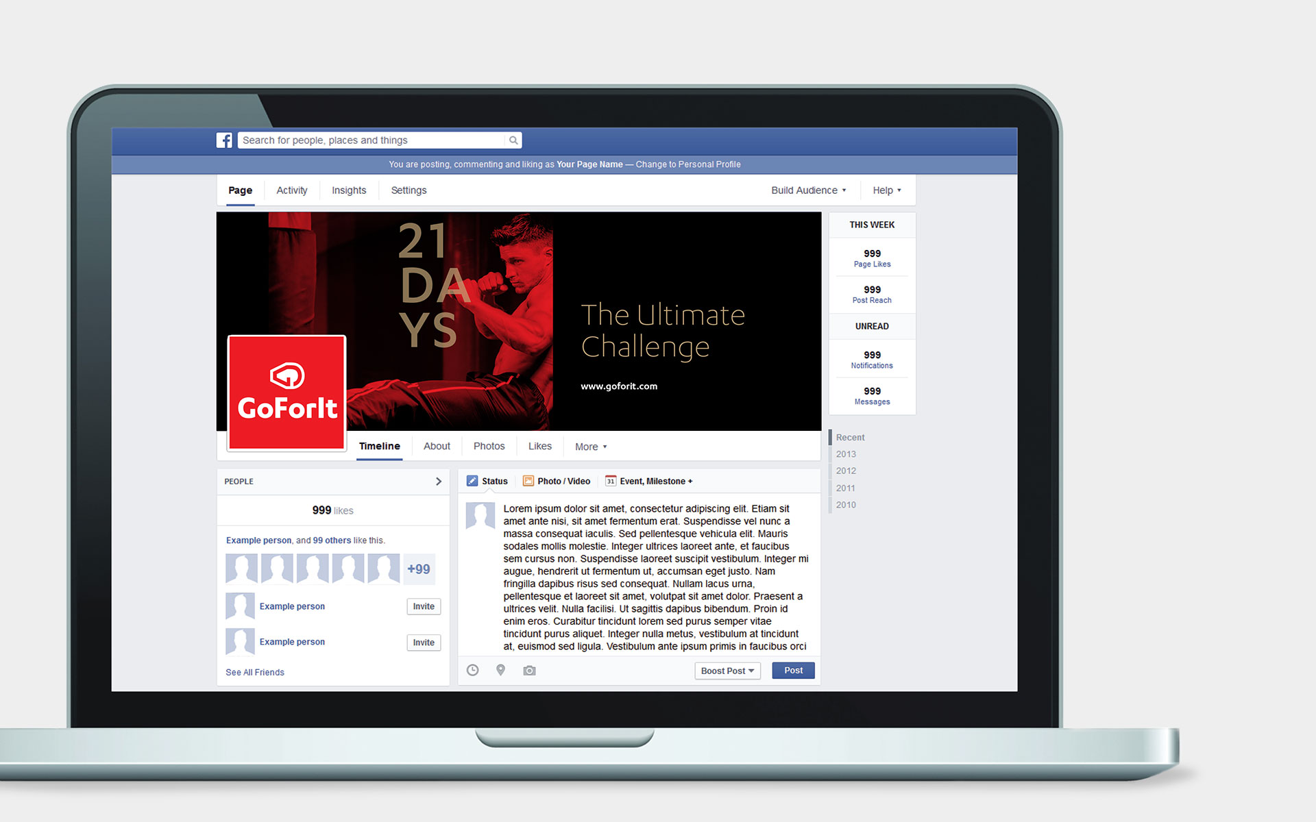
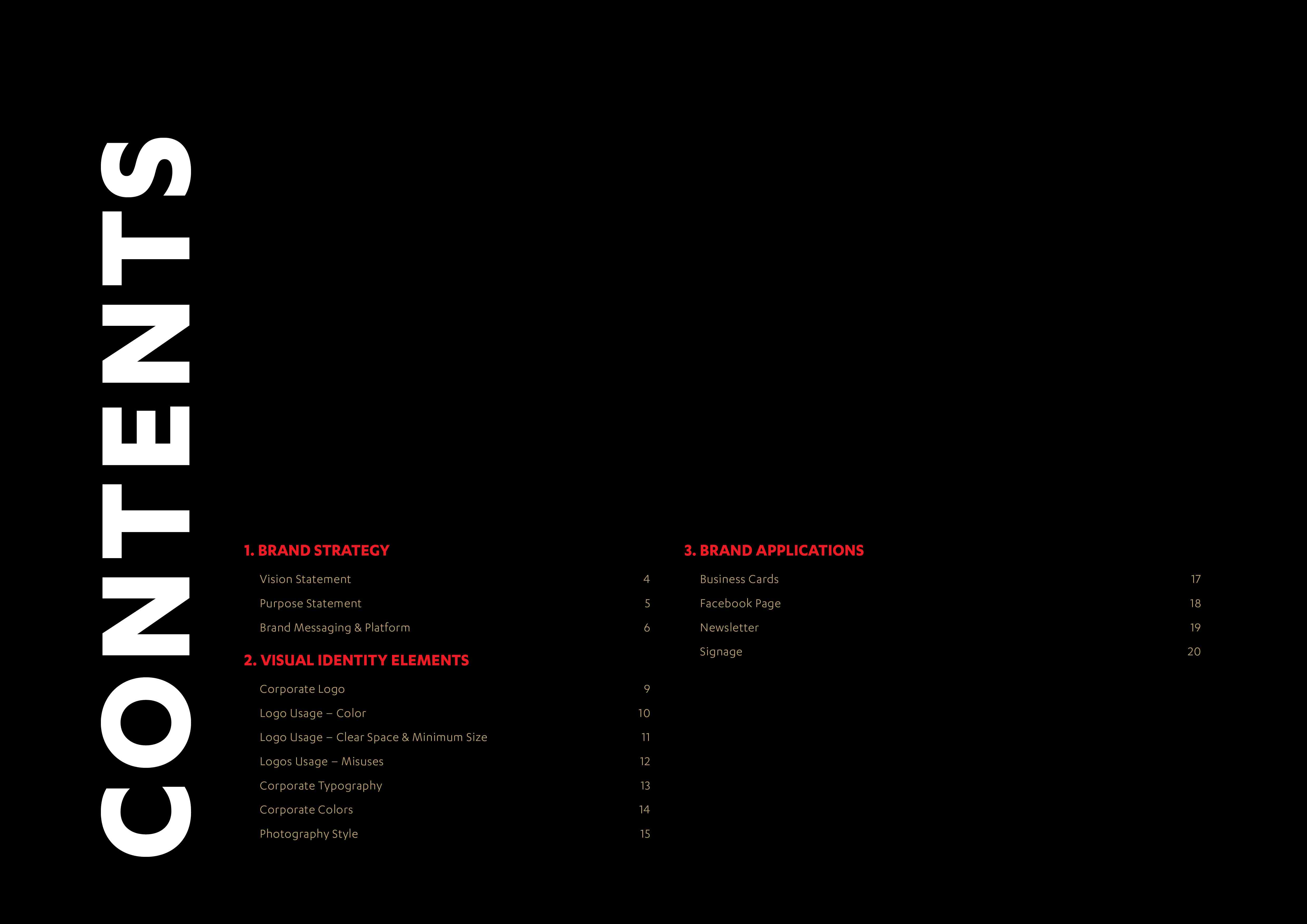
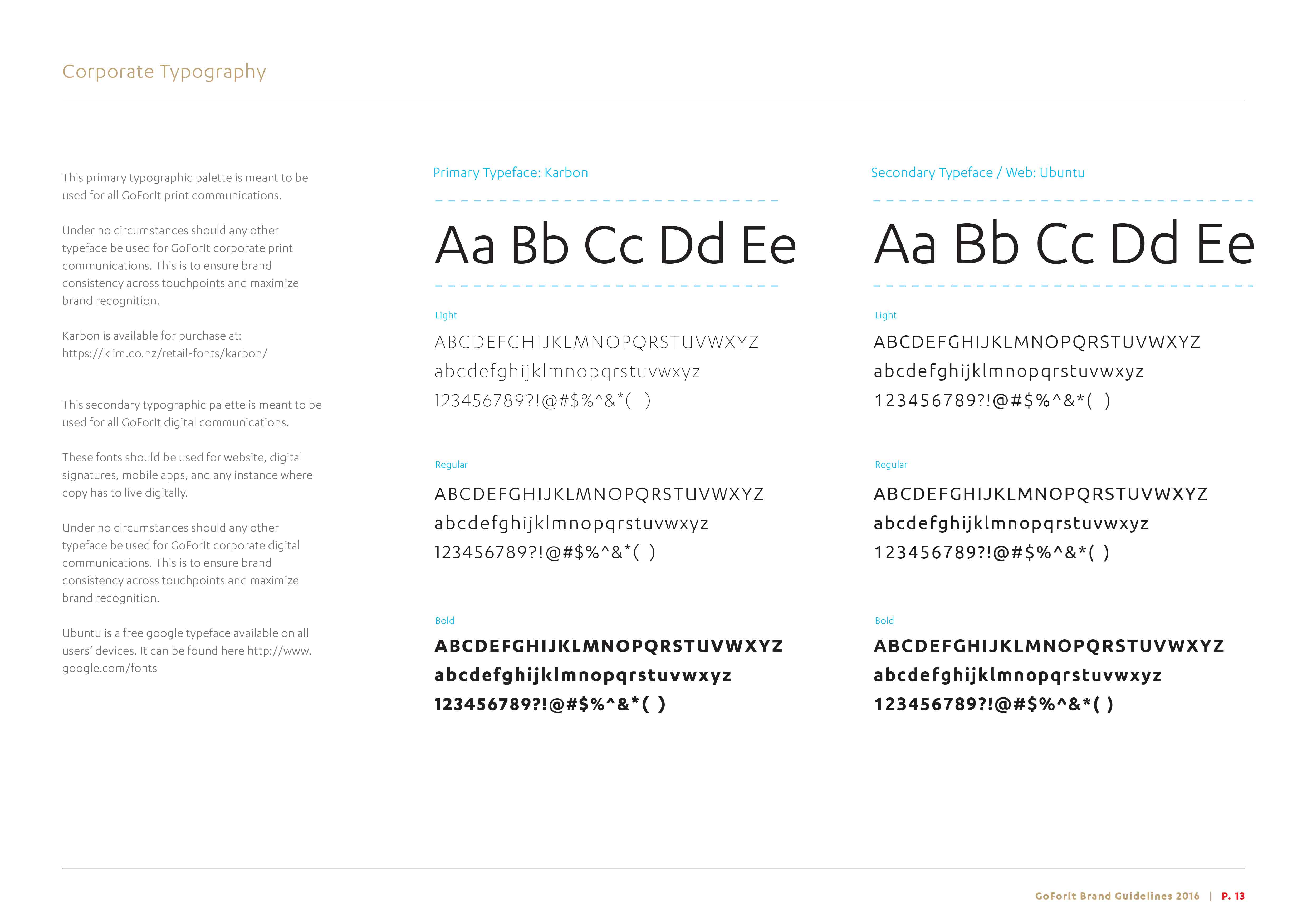
Visual identity system
