Intra–
Work done for Intra– CoachingNaming | Branding | Design | Digital | Logo Design
Intra– specializes in coaching for professionals as a response to issues related to leadership, self-confidence, stress management, and adaptability to change. The founder had focused on a specific type of coaching ideology which promotes introspective reflection within one’s self. To describe it, she had coined the term “Coaching d’Interiorité” (or Interior Coaching).
Intra– approached me with a naming and a branding scope, encompassing logo, visual identity, web design, and stationery. With the company based in Paris but aiming to reach a global clientele, the name had to be easily pronounced and understood in both English and French.
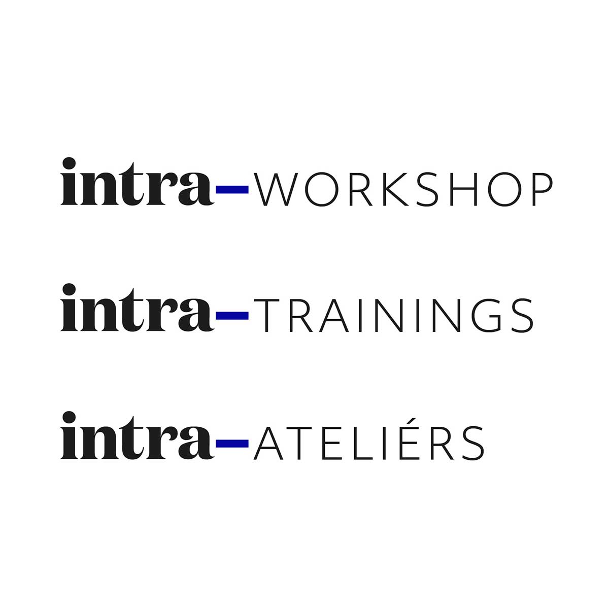
The name I came up with, intra–, was taken from the latin etymology of the word interior. The small addition of the hyphen next to it turned it into a prefix, and helped solidify the company’s ideology as we rolled out the architecture. The name described and leveraged the approach: intra–workshops, intra–trainings, etc…
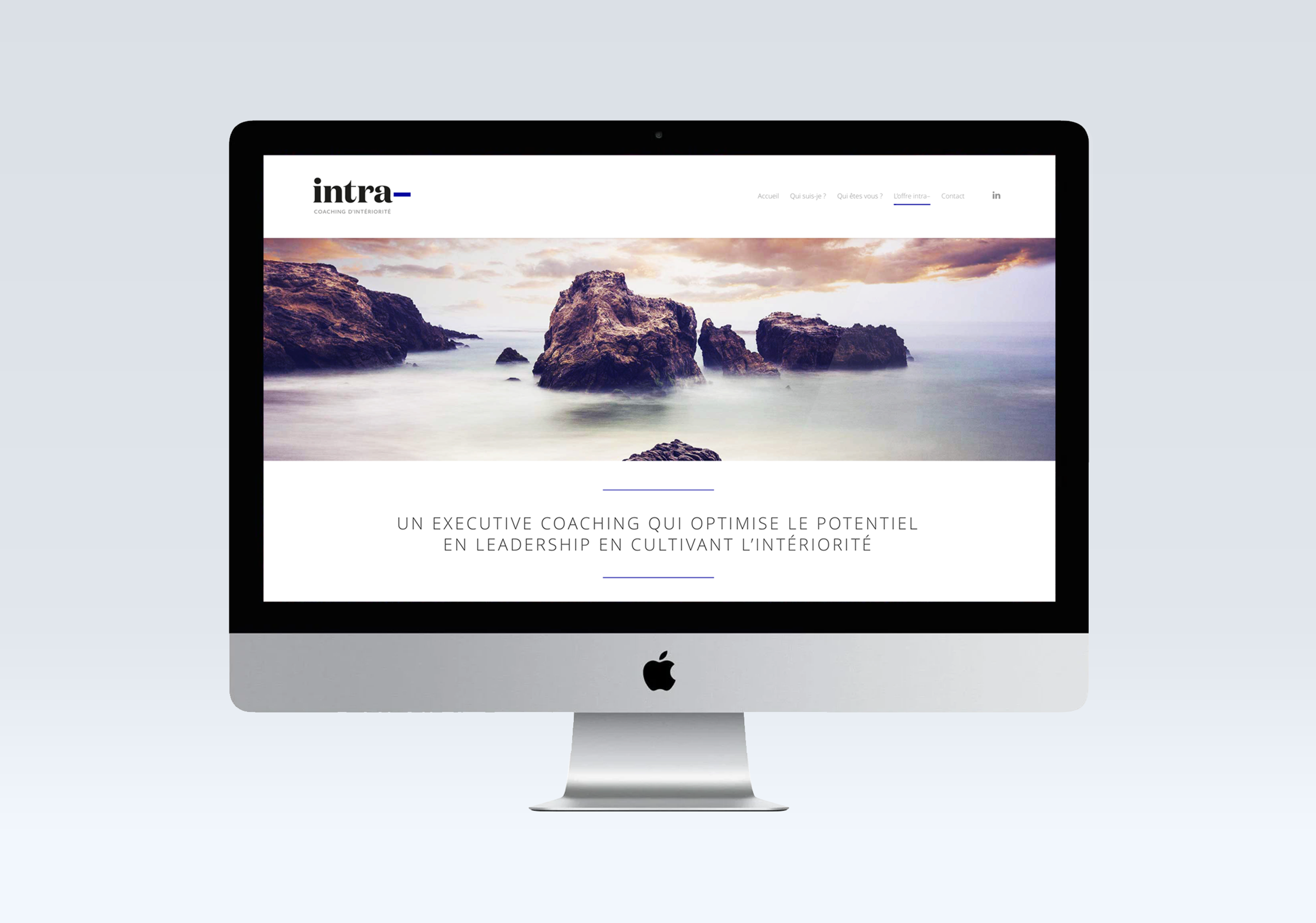
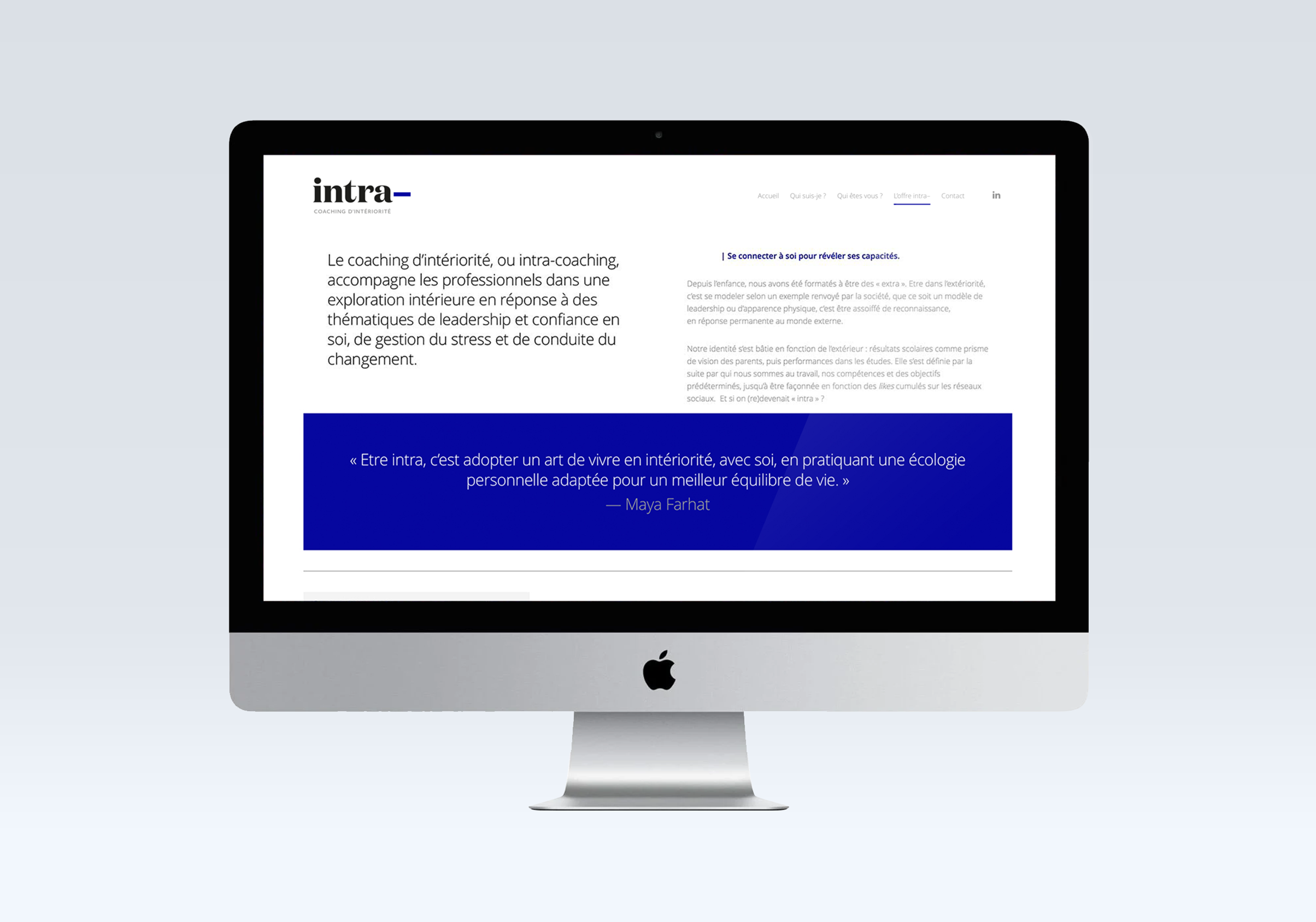
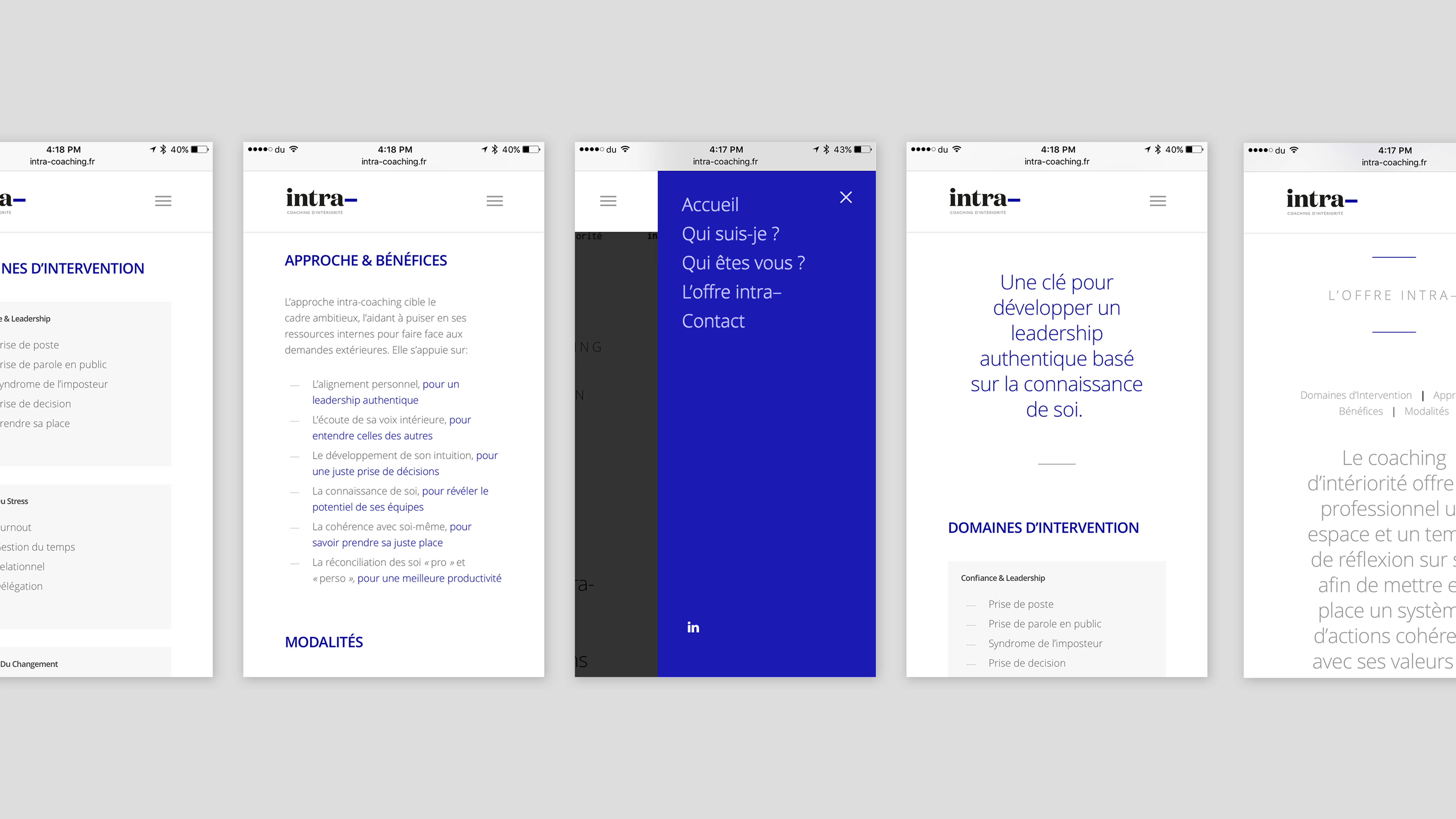
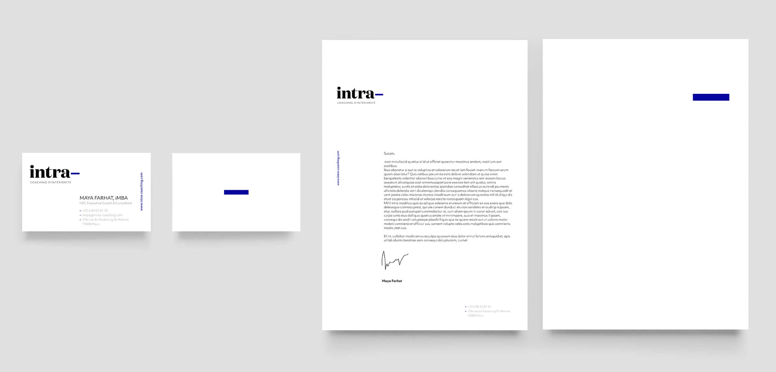
The logo created for it put the emphasis on the hyphen, and made use of a bold, curved typeface that conveyed approachability, confidence, and a welcoming feel. The choice of colors moved away from the typical pastels used in the coaching industry, and opted instead for an electric, vibrant blue, reminiscent of the corporate world. The system was designed to communicate an open, light feel through the use of a generous amount of white space.
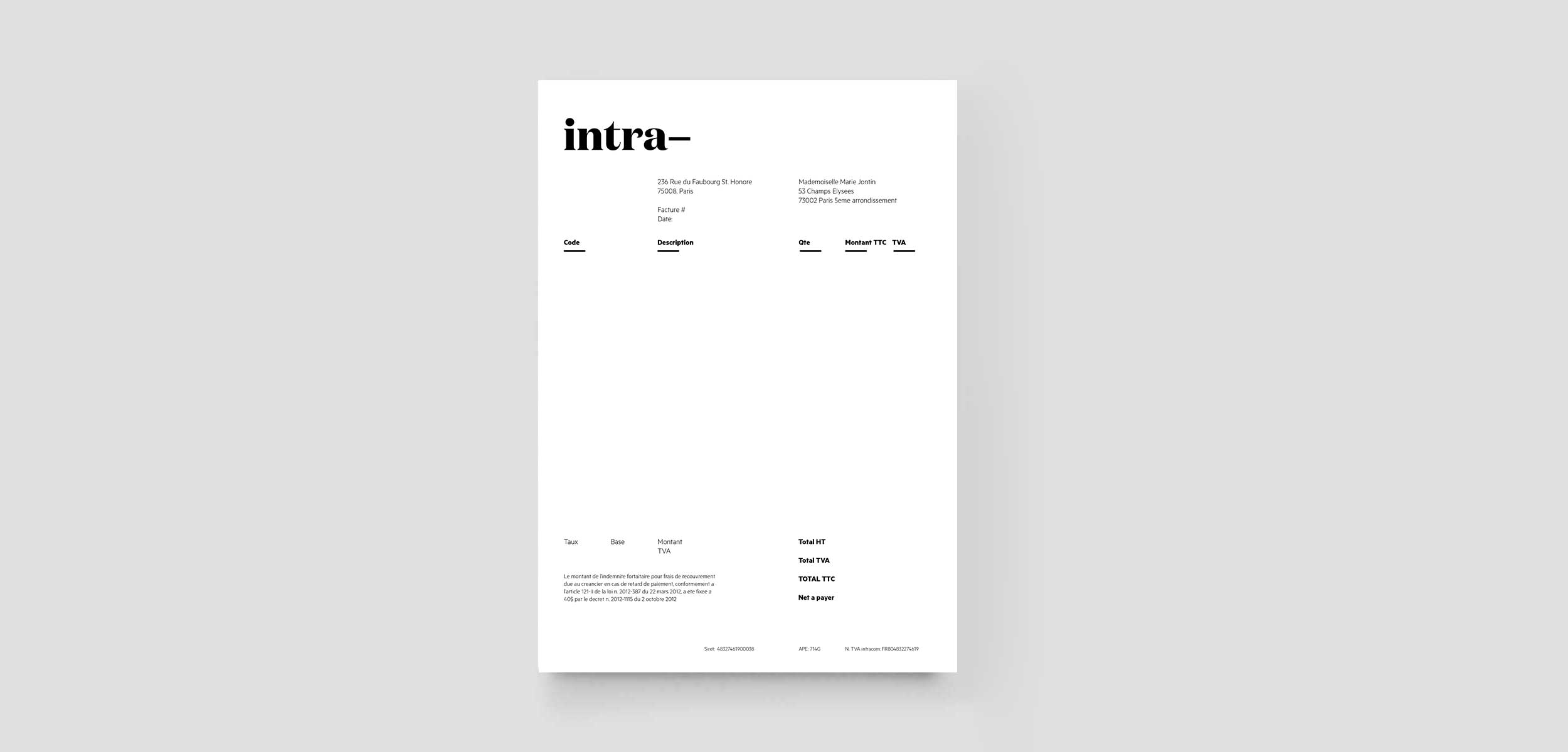
Logo and stationery
Web design and development