Basharacare
Work done for Basharacare LLCDesign | Art Direction | Branding | Digital
Online skincare retailer BasharaCare approached me to help them reposition their brand and create a visual identity that reflected their new personality. Their communications being mainly on social media, the system had to strike a balance of simplicity and visual recognition, to enable them to put out posts frequently and consistently.
For a brand that is solution-oriented, the visual identity had to convey efficiency, order, and competence. While their old branding appealed to an older female demographic, the new identity had to widen the age group and include younger male and female consumers that are tech-savvy and experienced online shoppers.
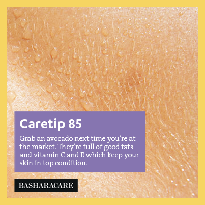
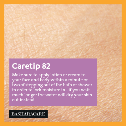
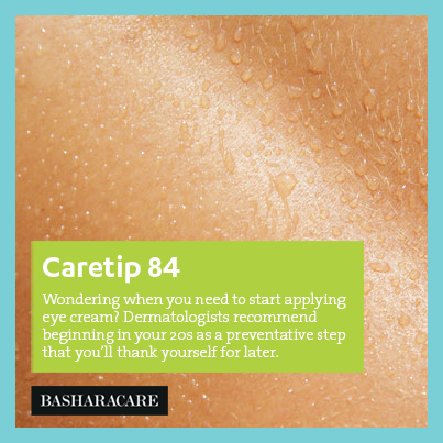
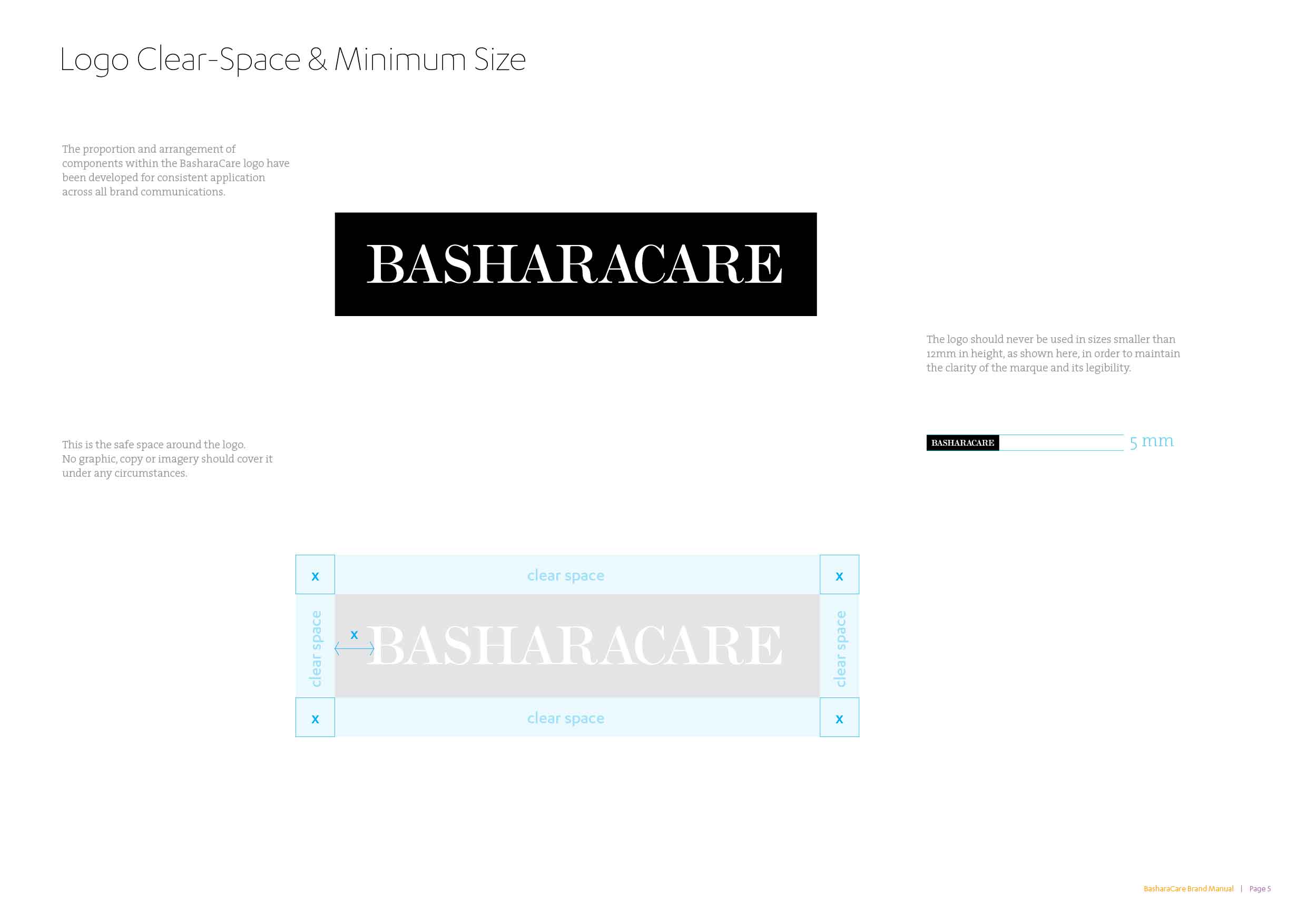
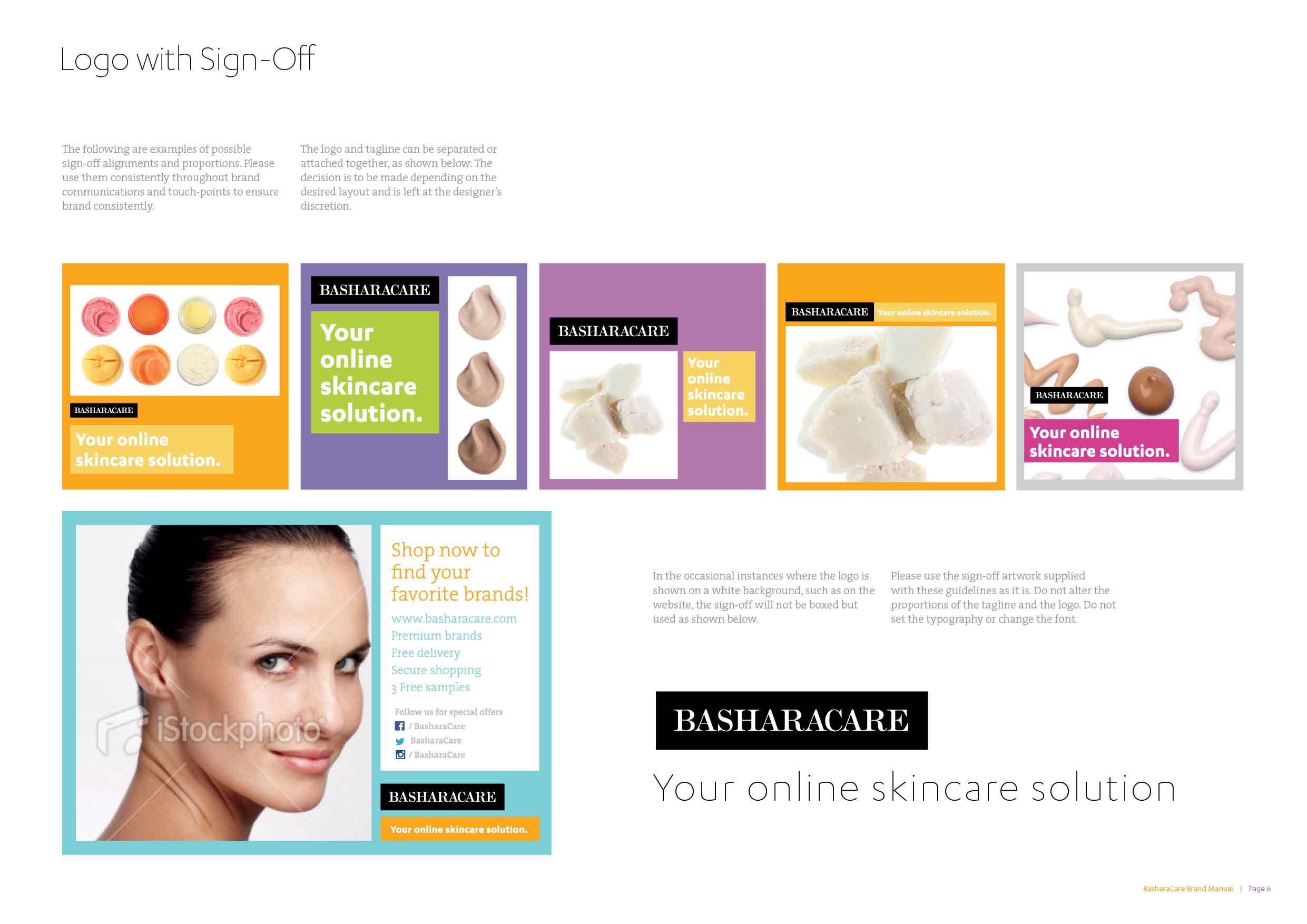
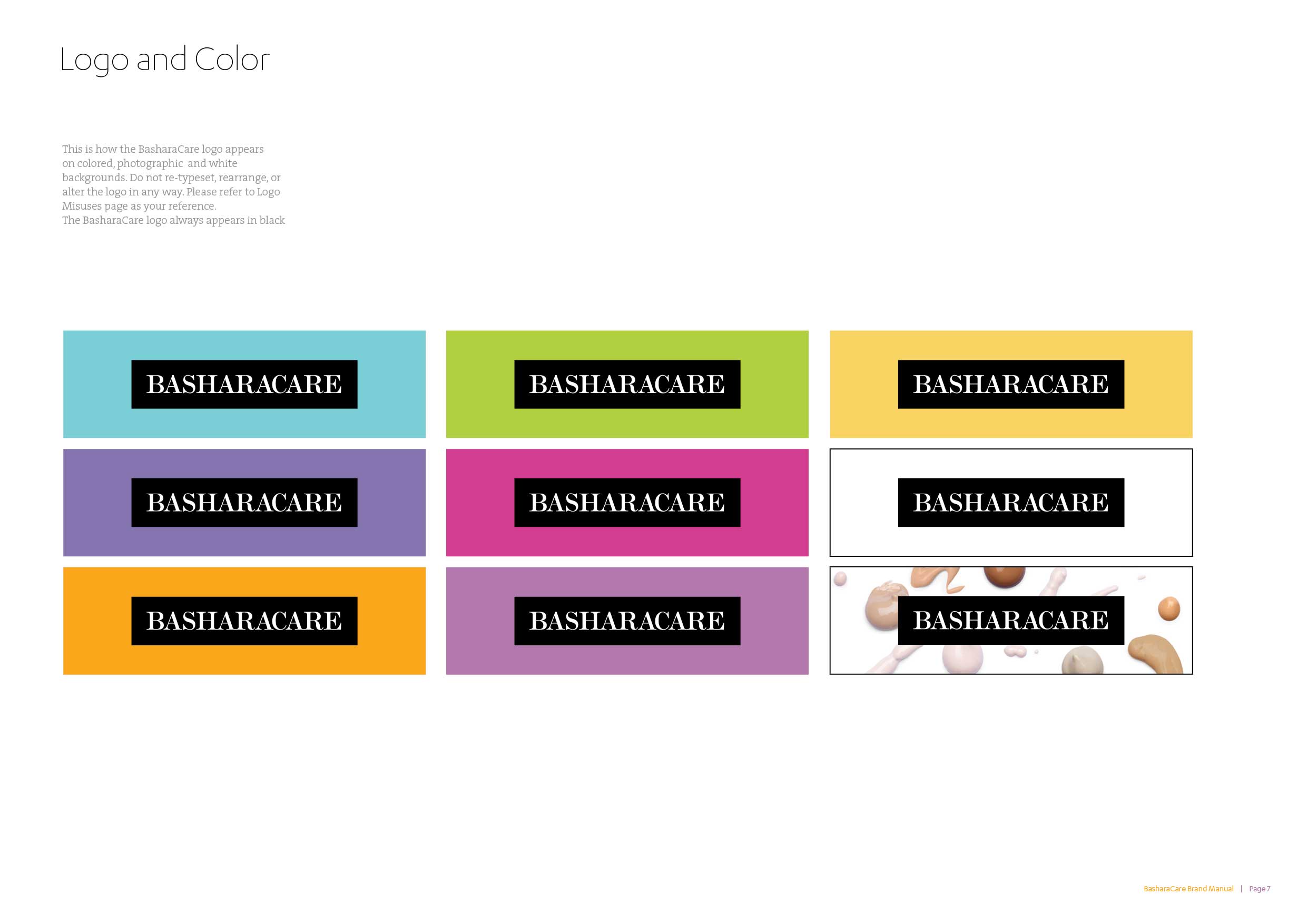
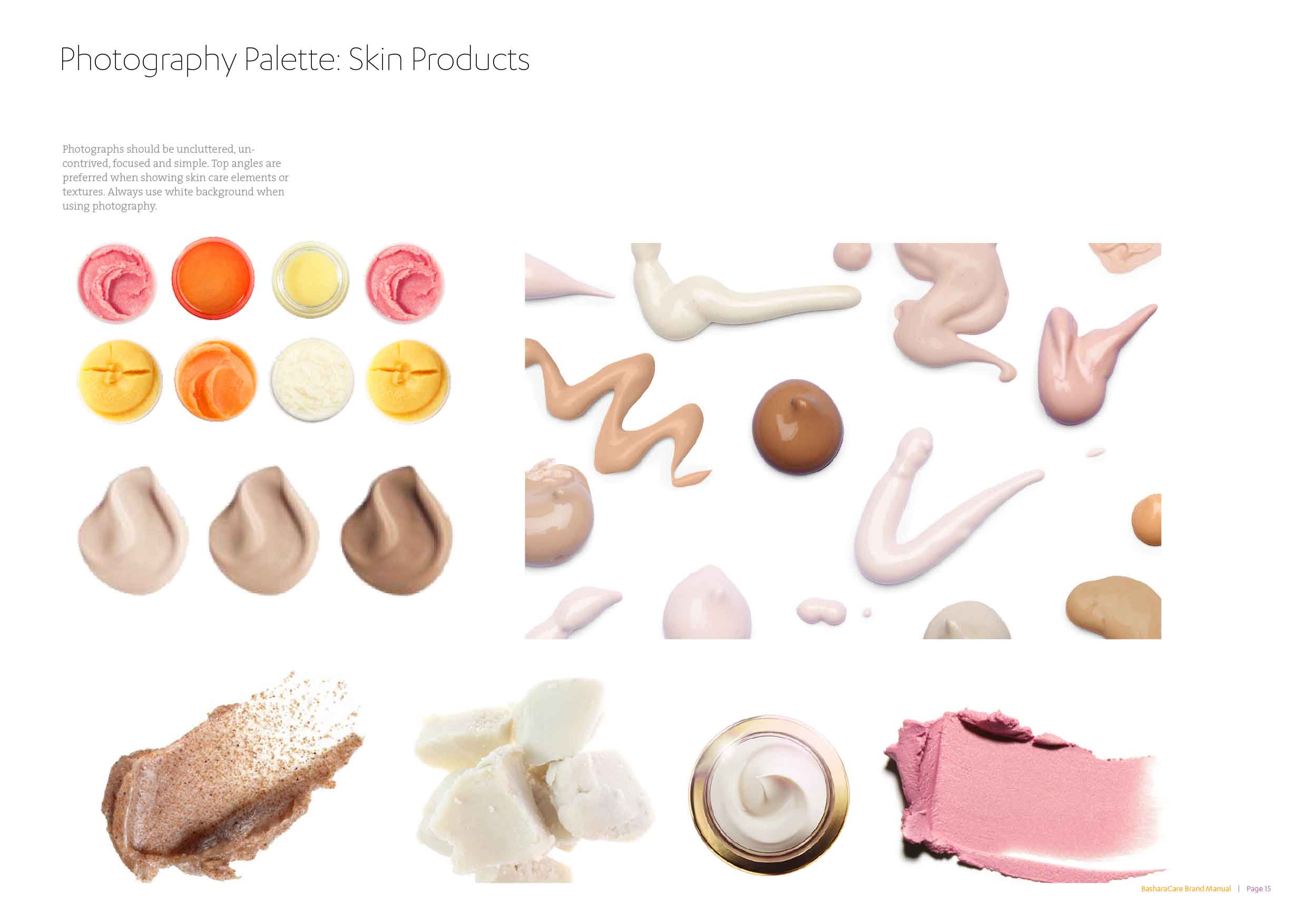
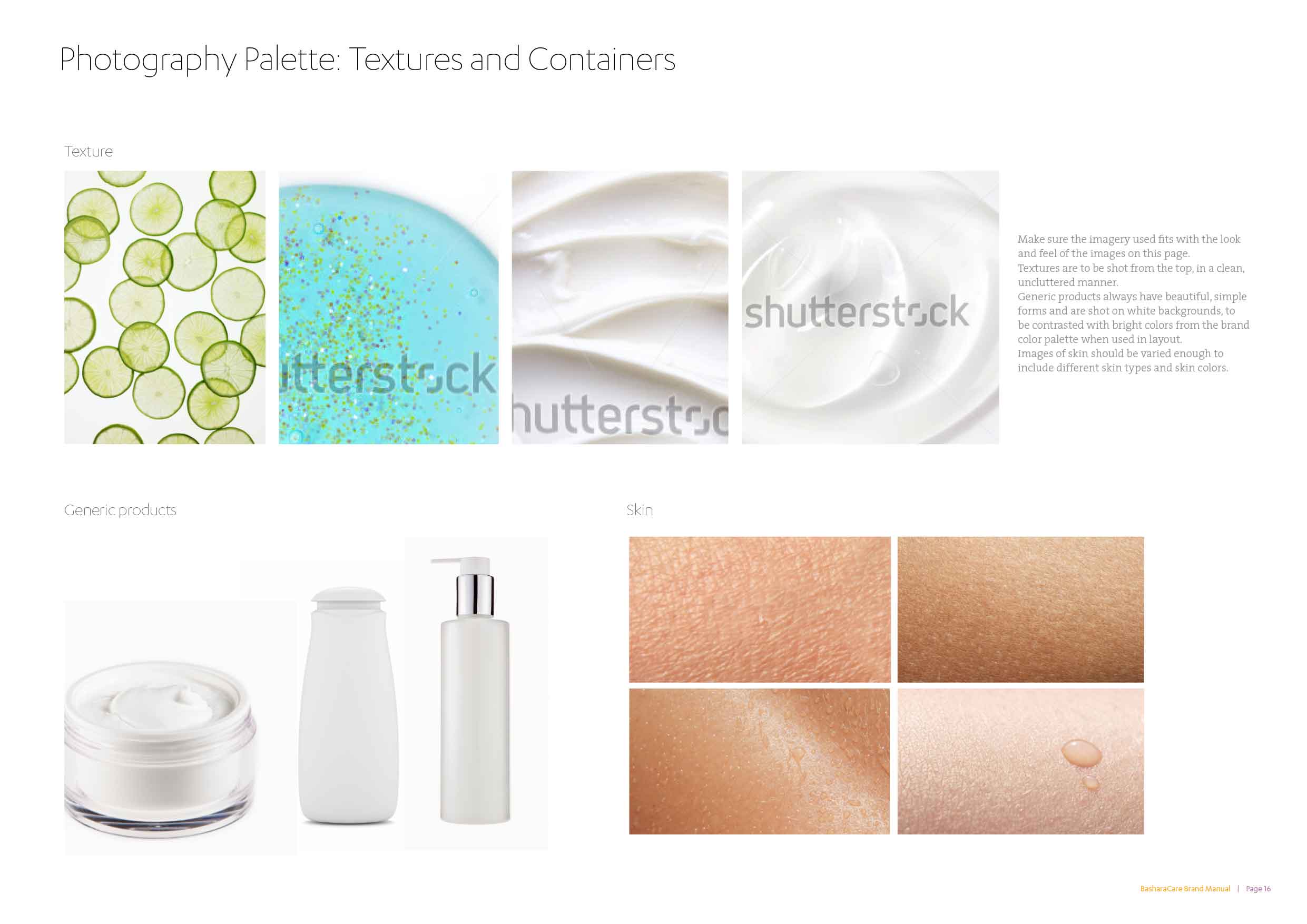
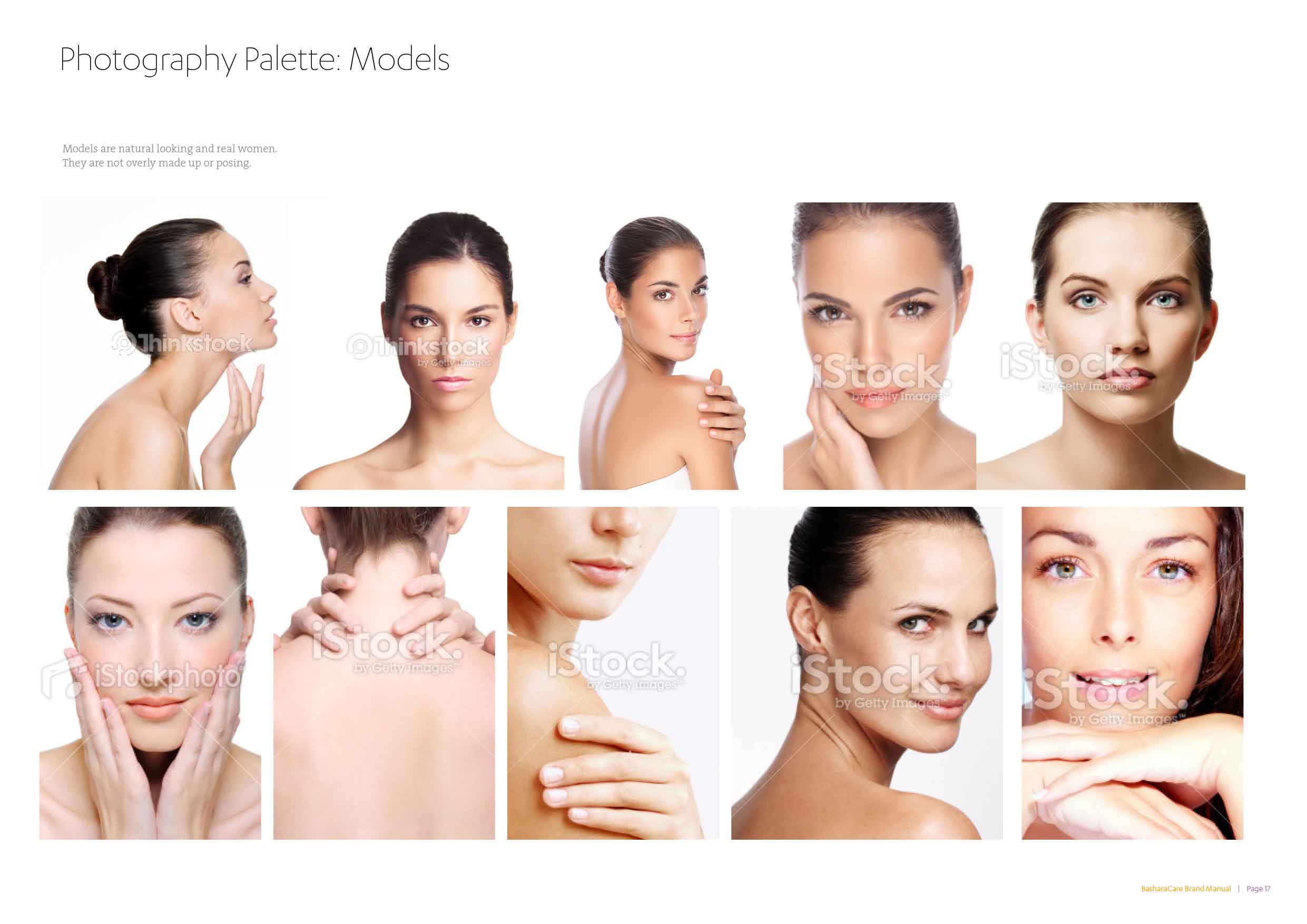
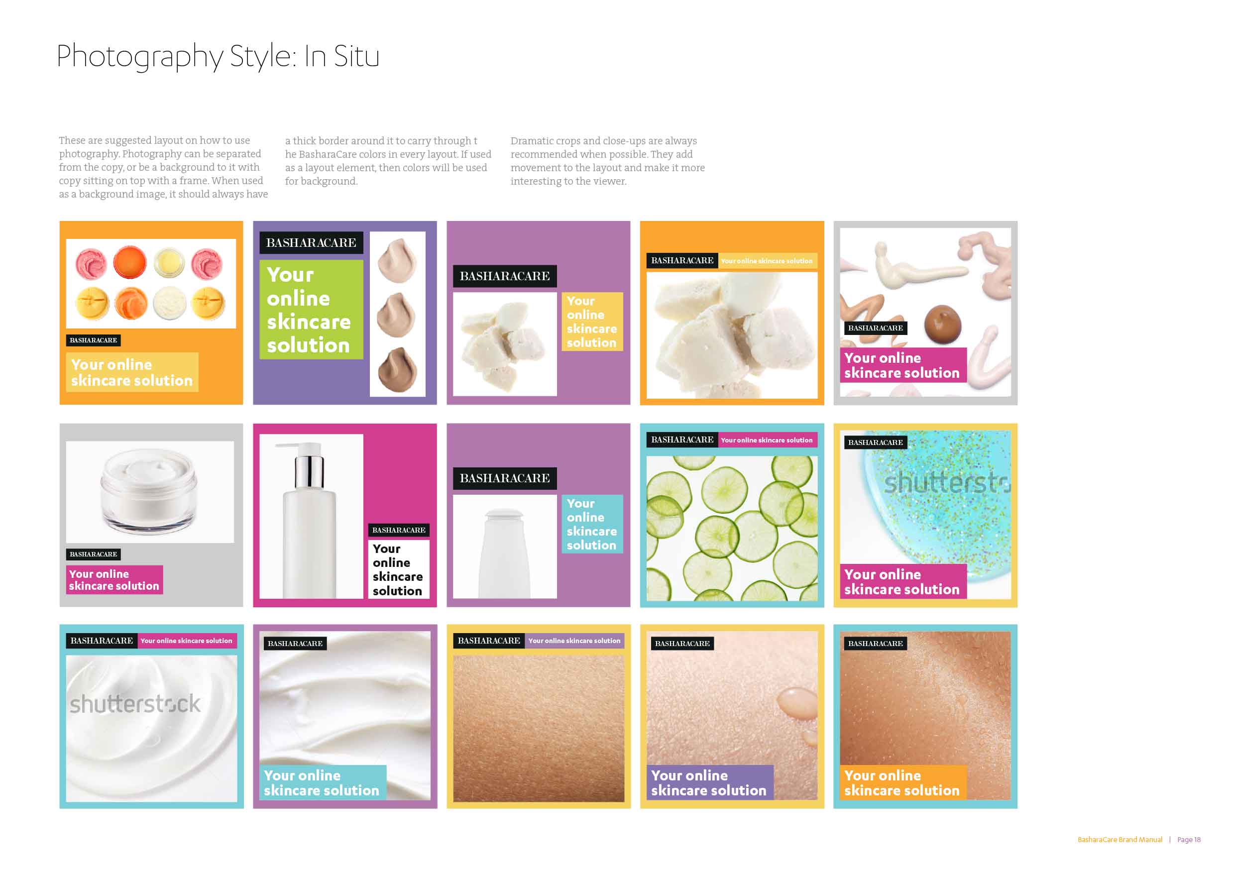
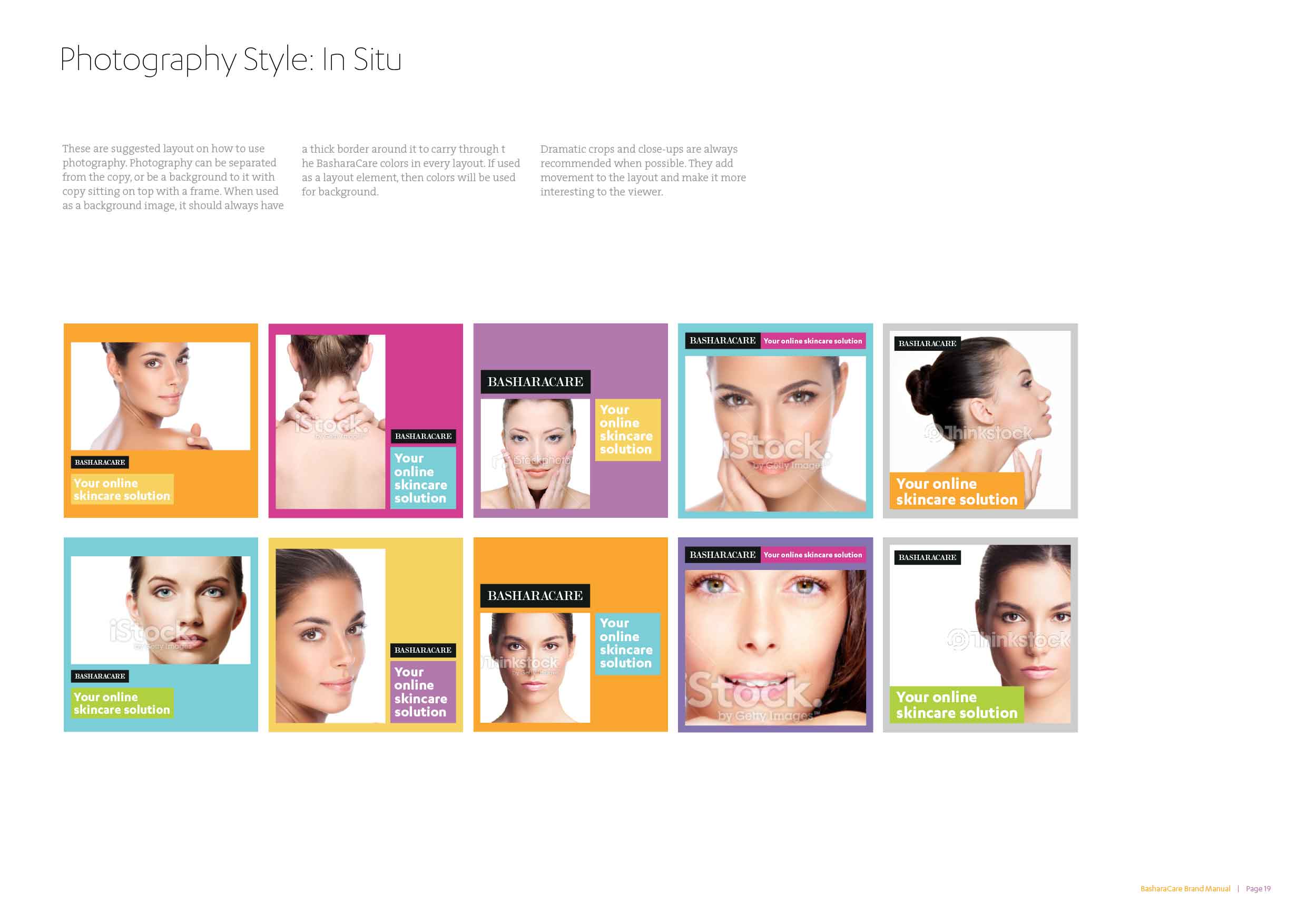
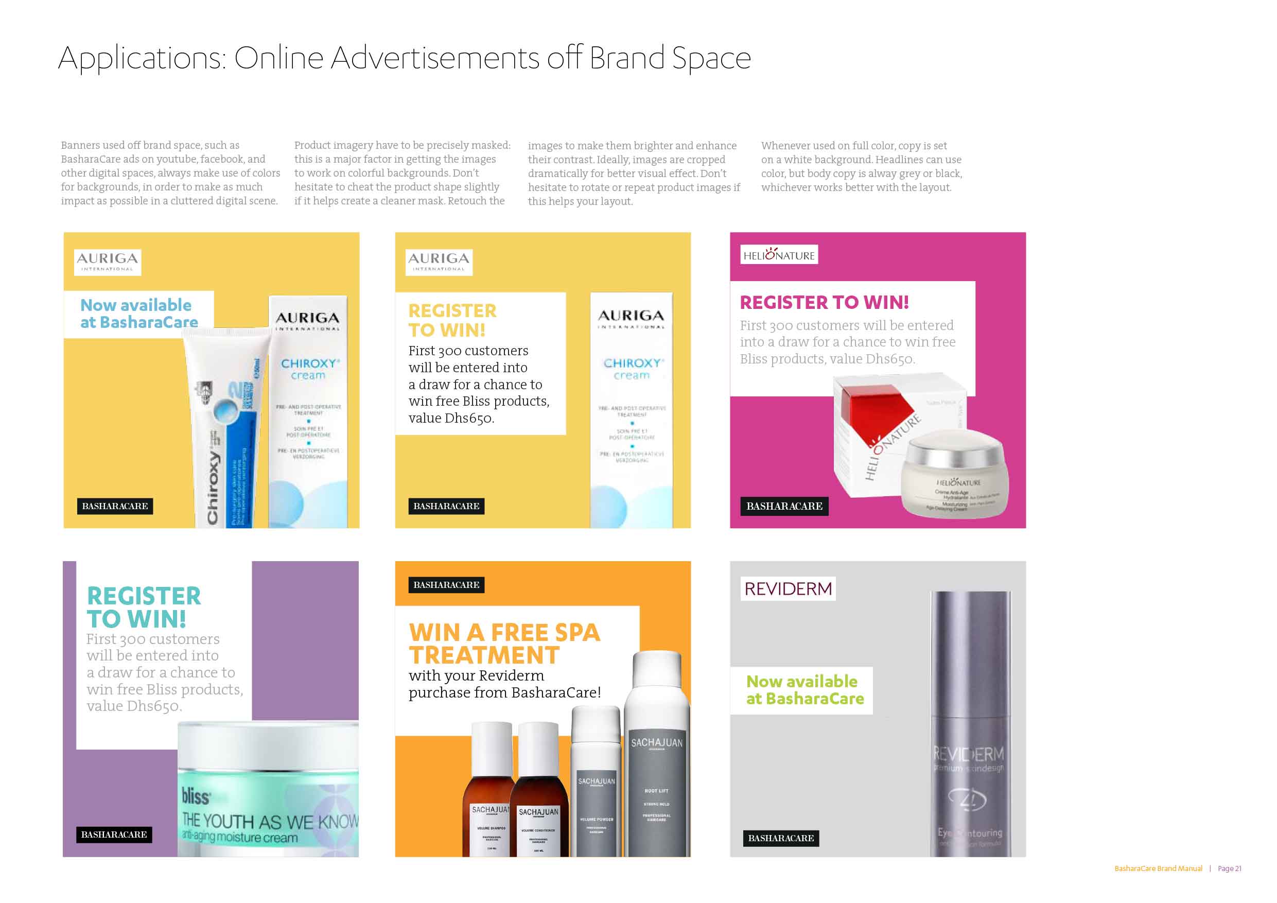
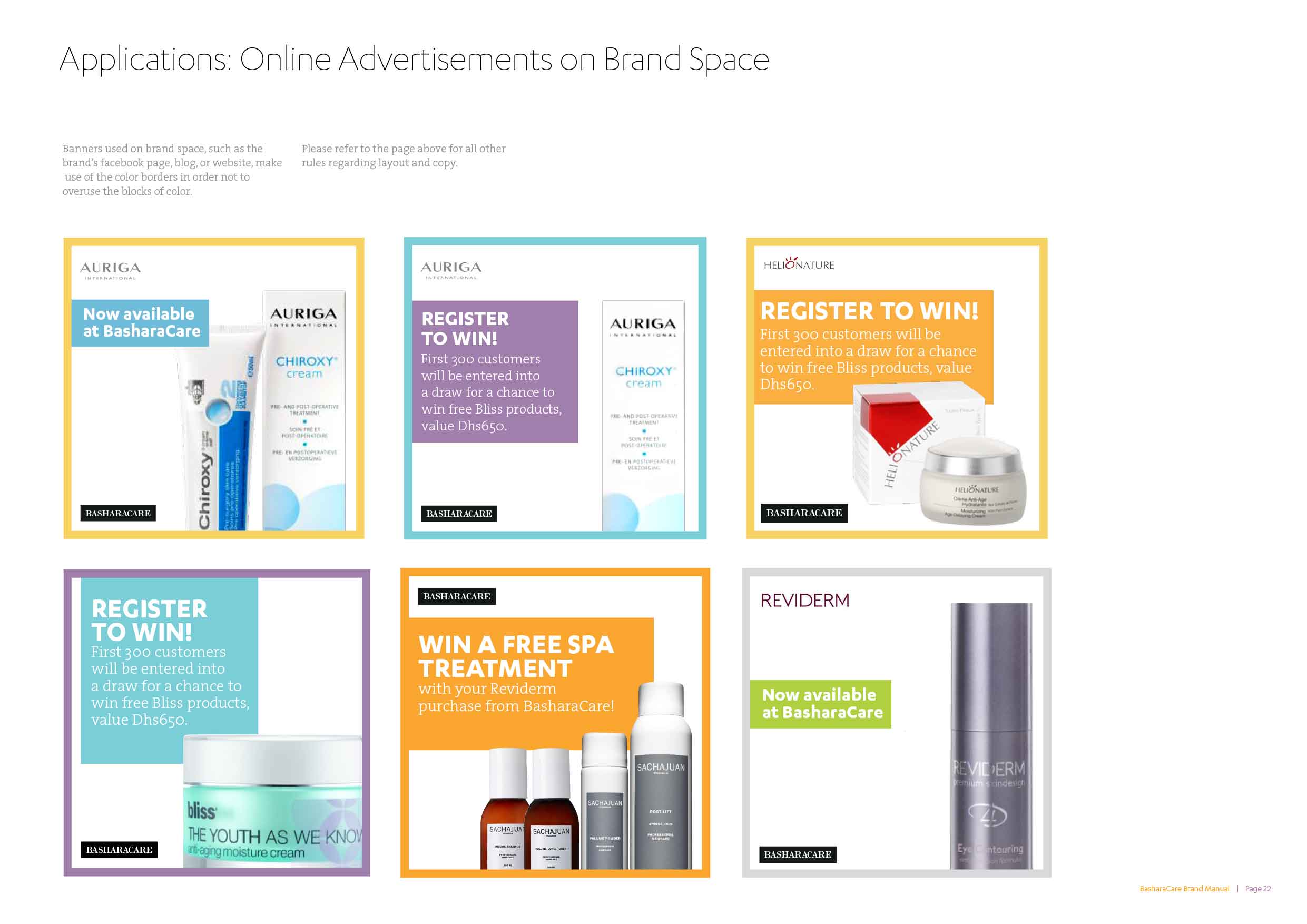
With a logo that already had recognition with current customers, it was best to improve on it rather than create a new iteration of it. It was revisited only to make it fit within the system and be screen-adapted. The system developed made use of a variety of colors, making the look and feel open, approachable and optimistic. The use of Karbon, a curvy typeface that is both friendly and structured, was a choice that helped communicate informally, yet professionally. Image palettes, art direction guidelines, and a strict grid system were put in place to ensure their ads and posts could be adapted to any web format while being on-brand.
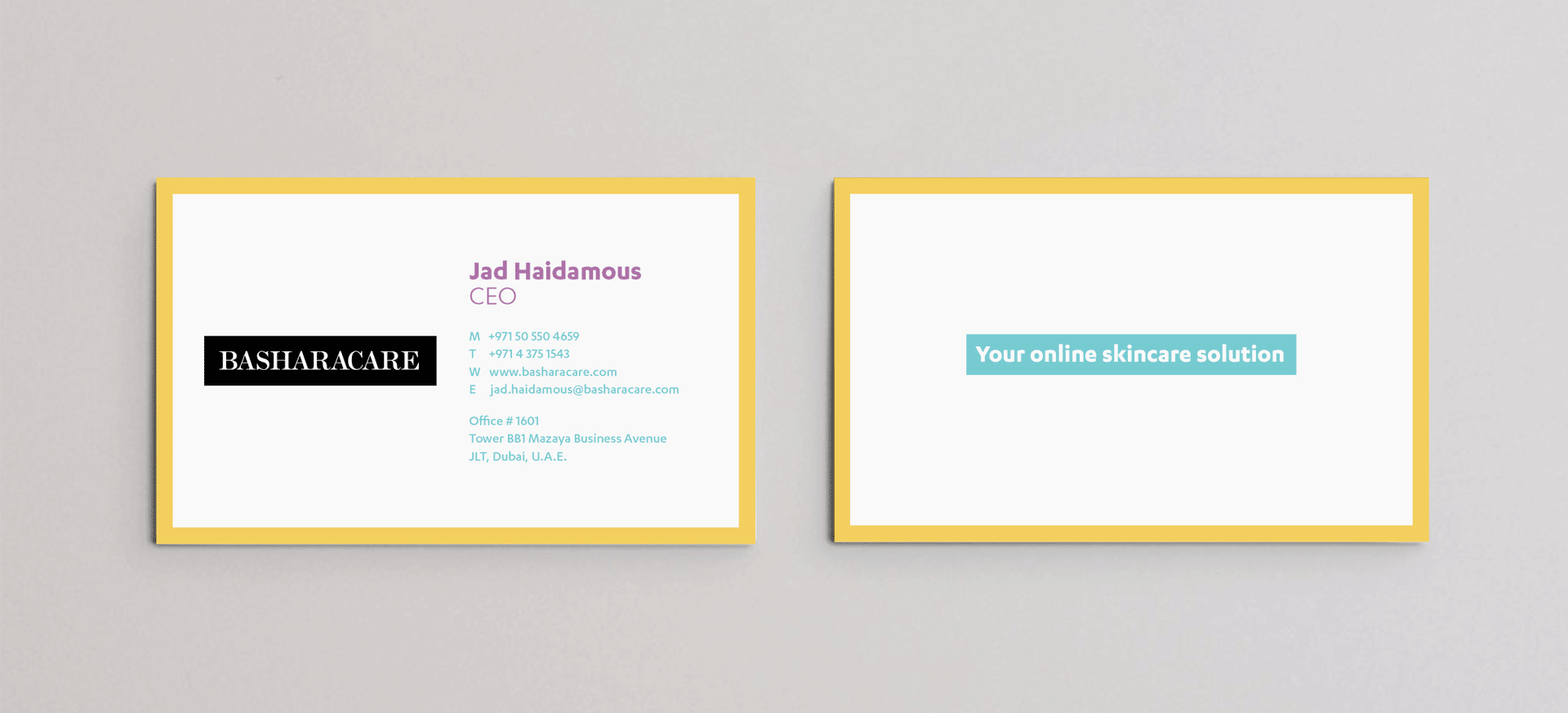
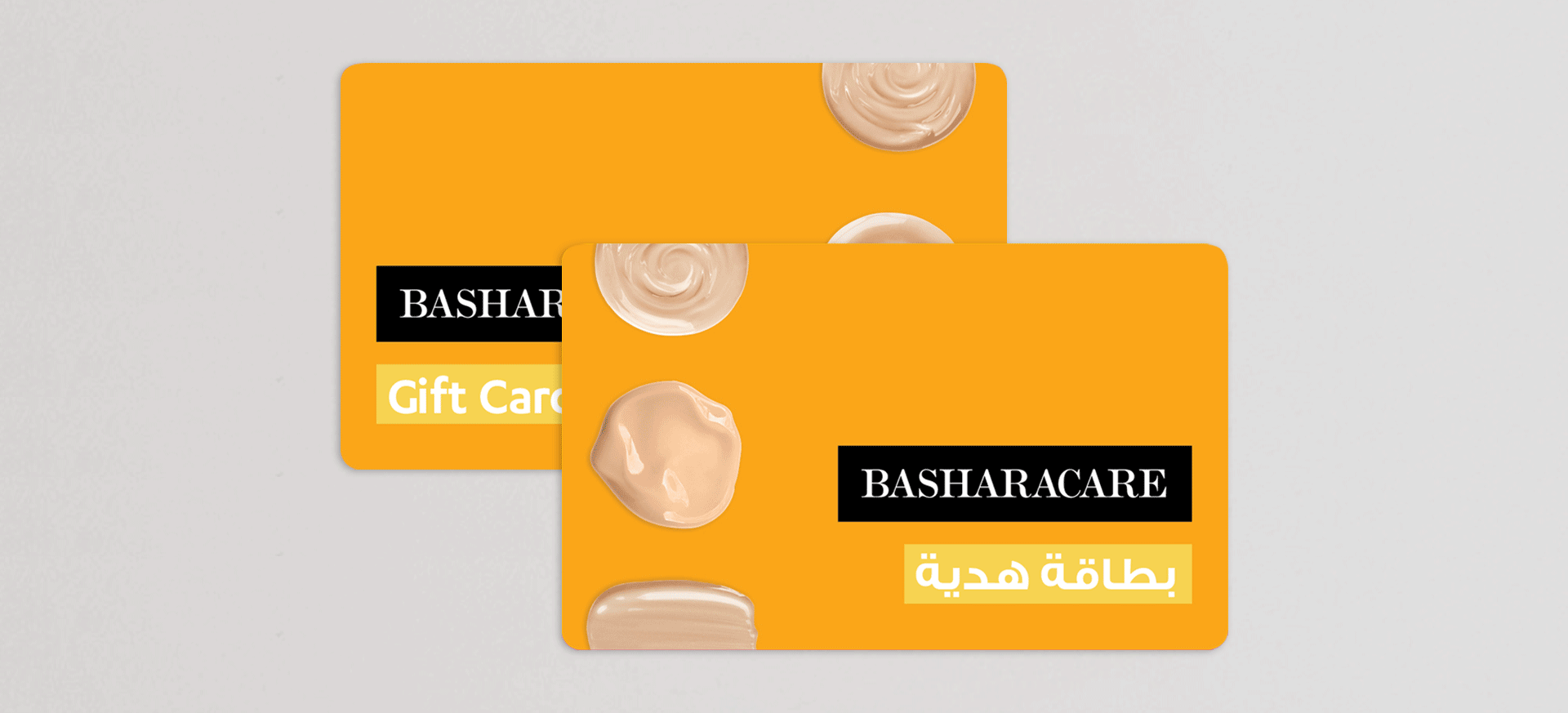
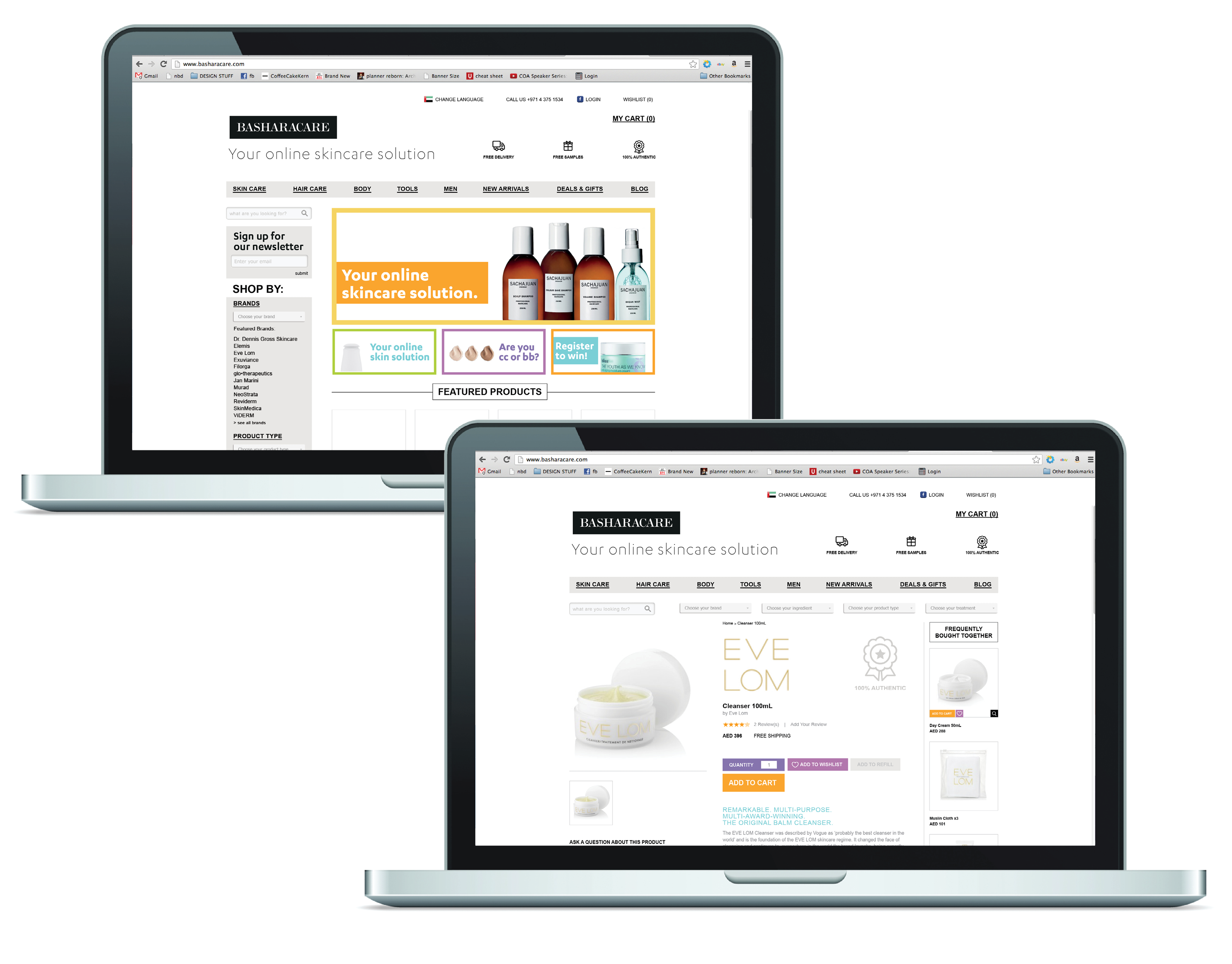
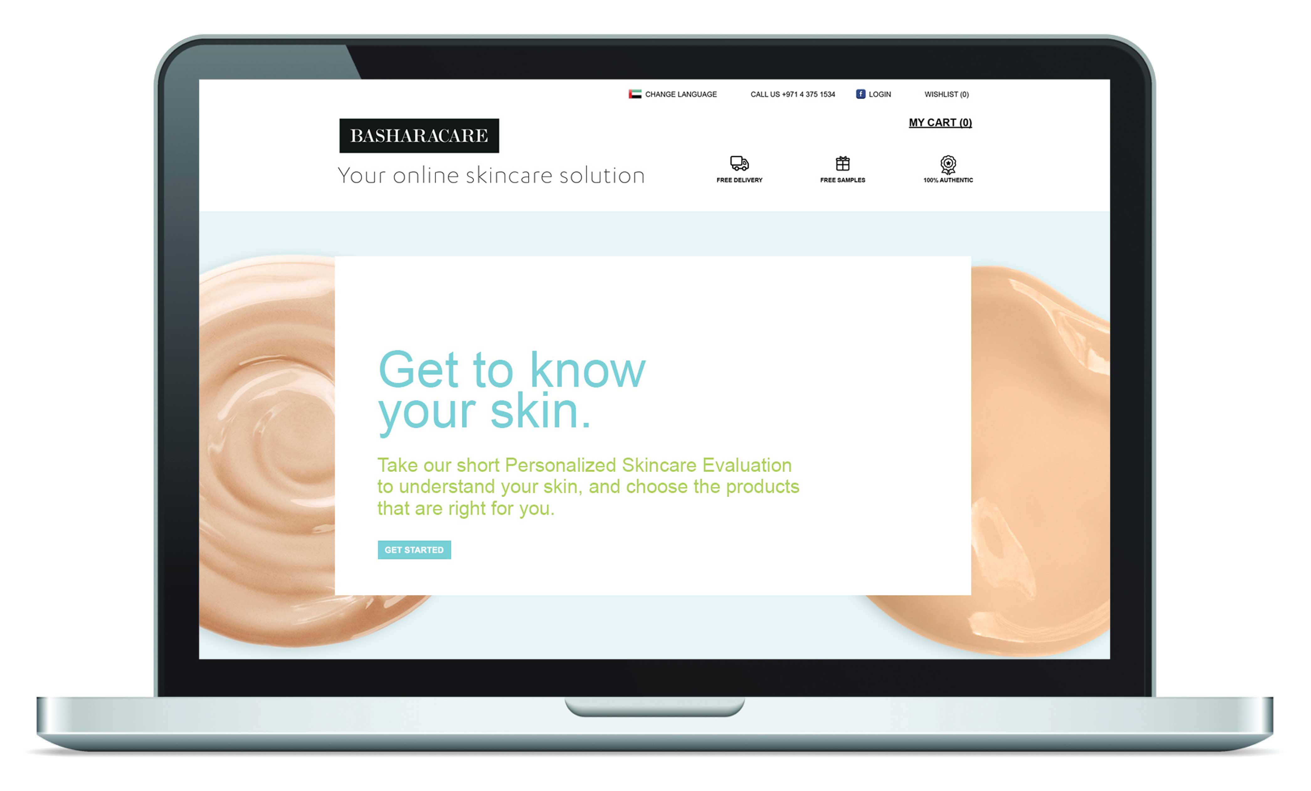
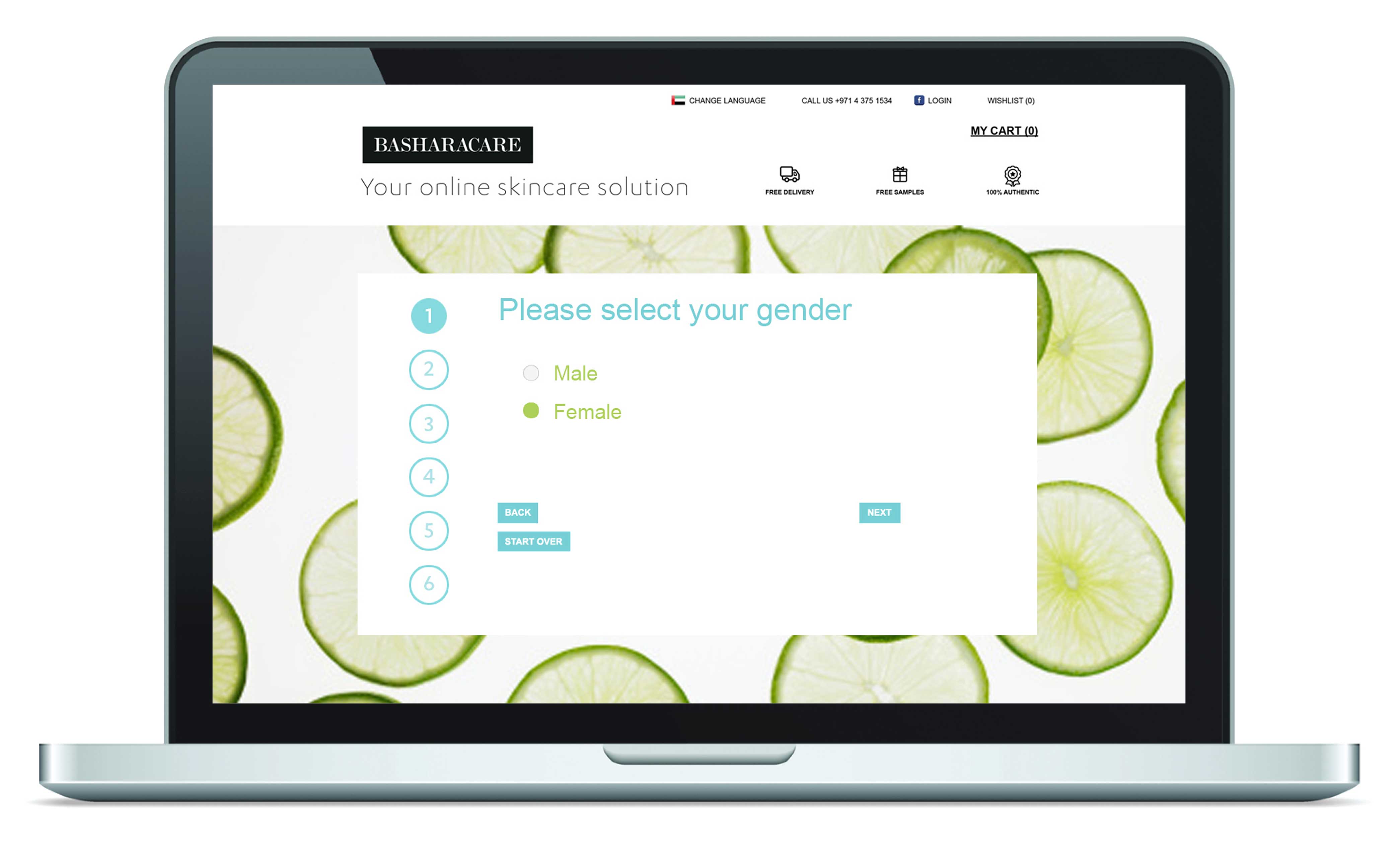
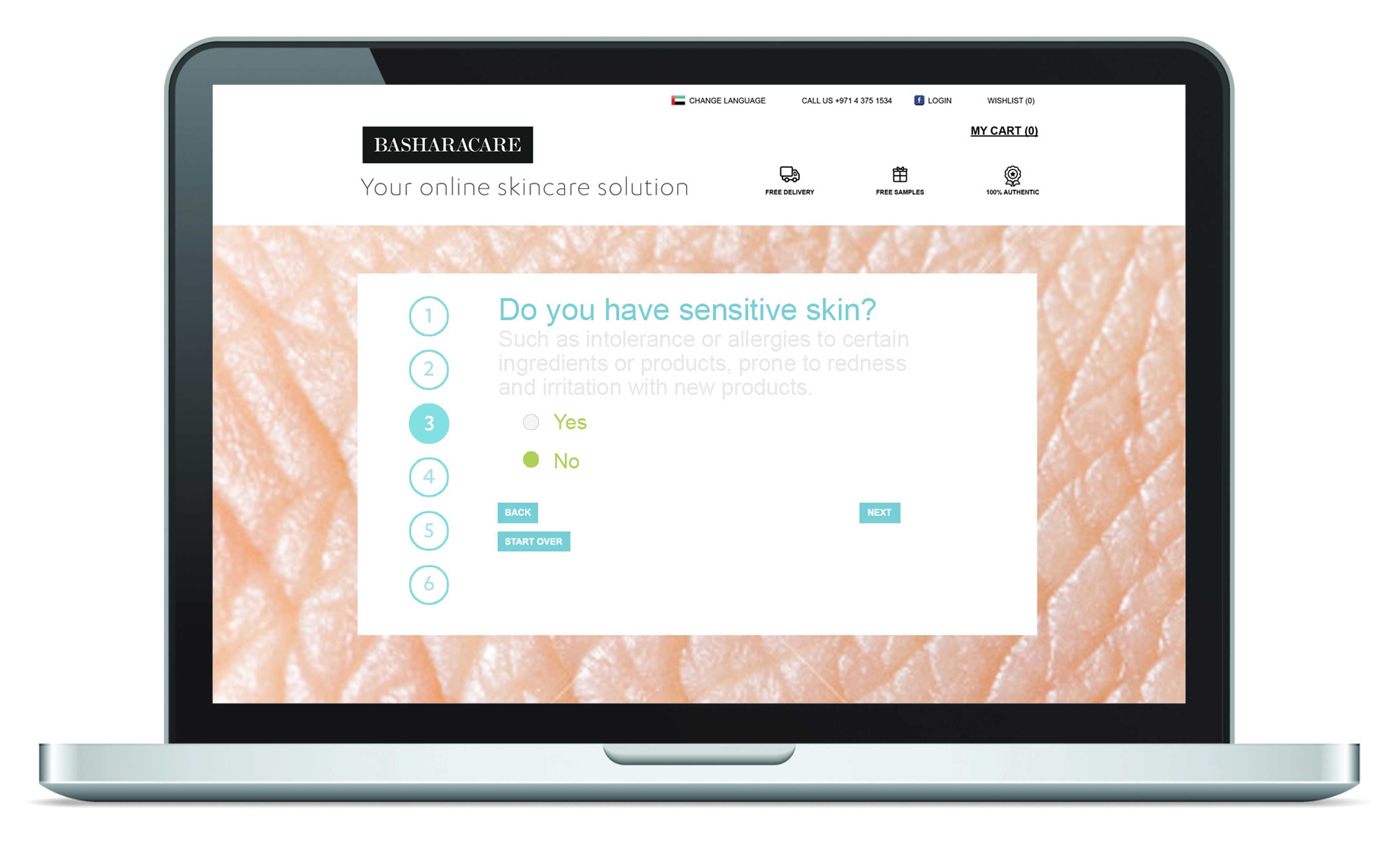
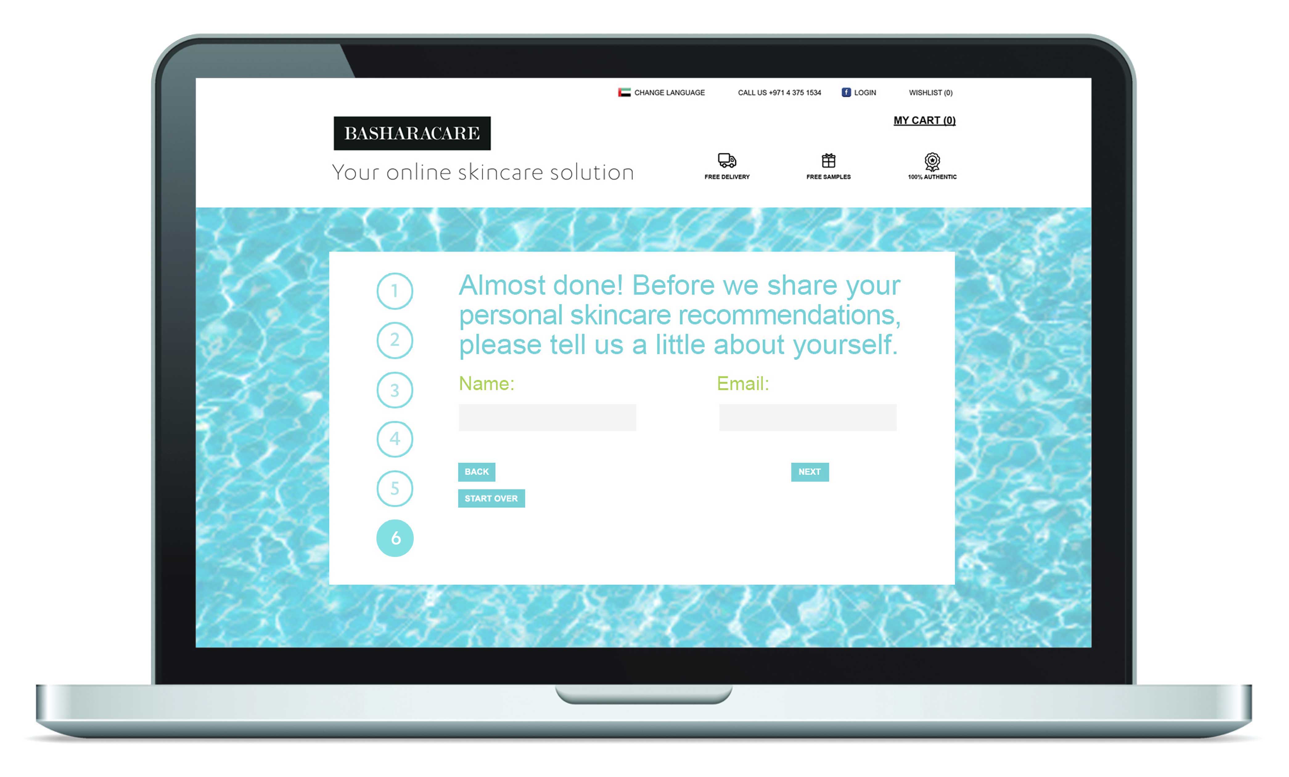
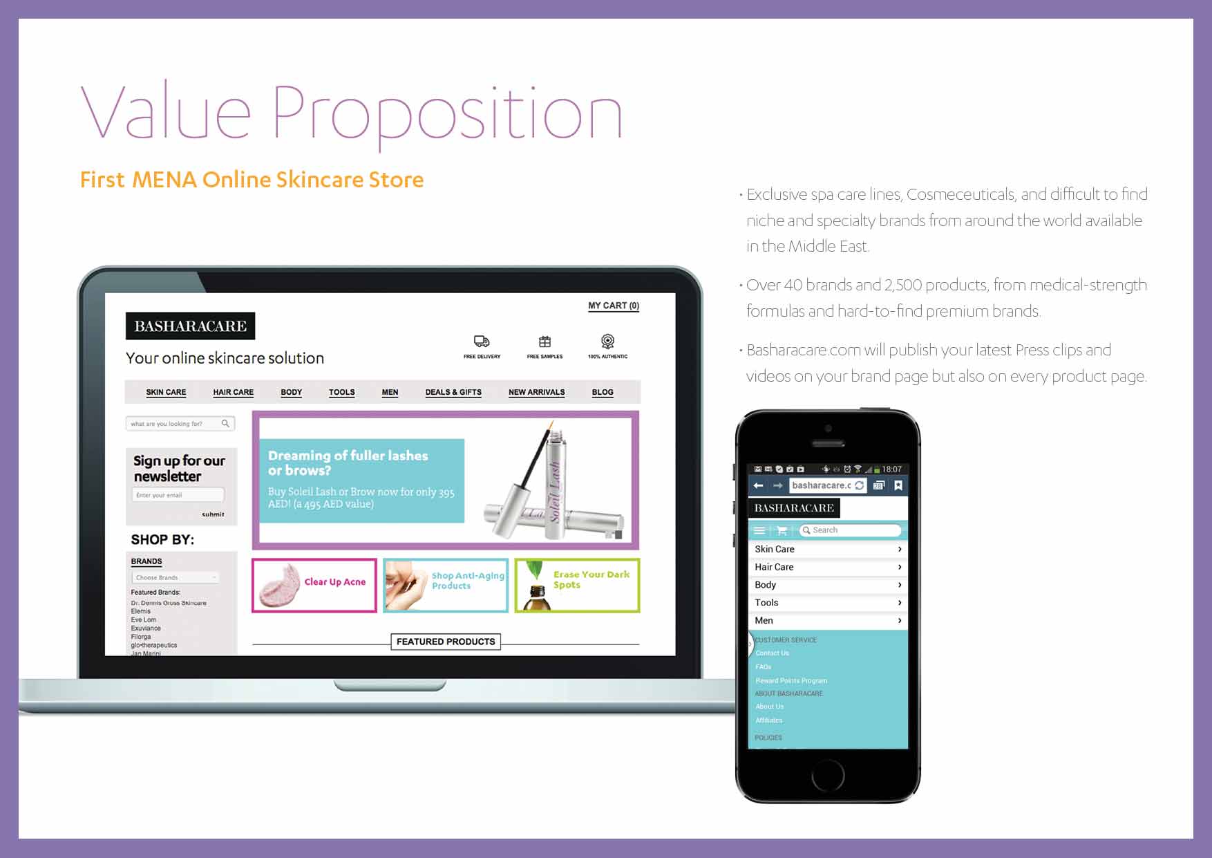
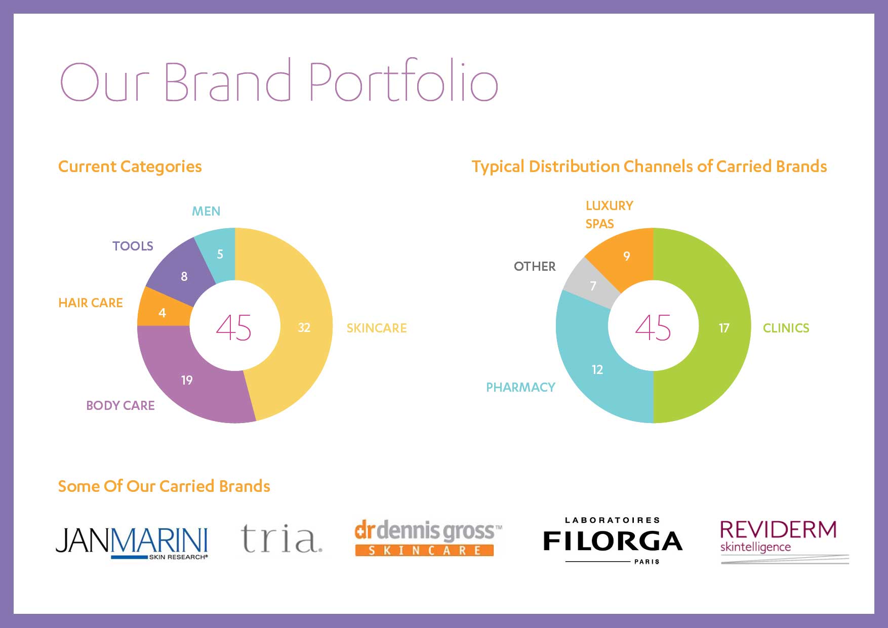
Website, digital assets, business cards, gift cards were all rolled out, with an in-depth guidelines document that explained how to create new touch-points consistently. More importantly, the system allowed the brand to showcase the different brands they sell (and their logos) along with their own, without compromising on their own brand expression.

