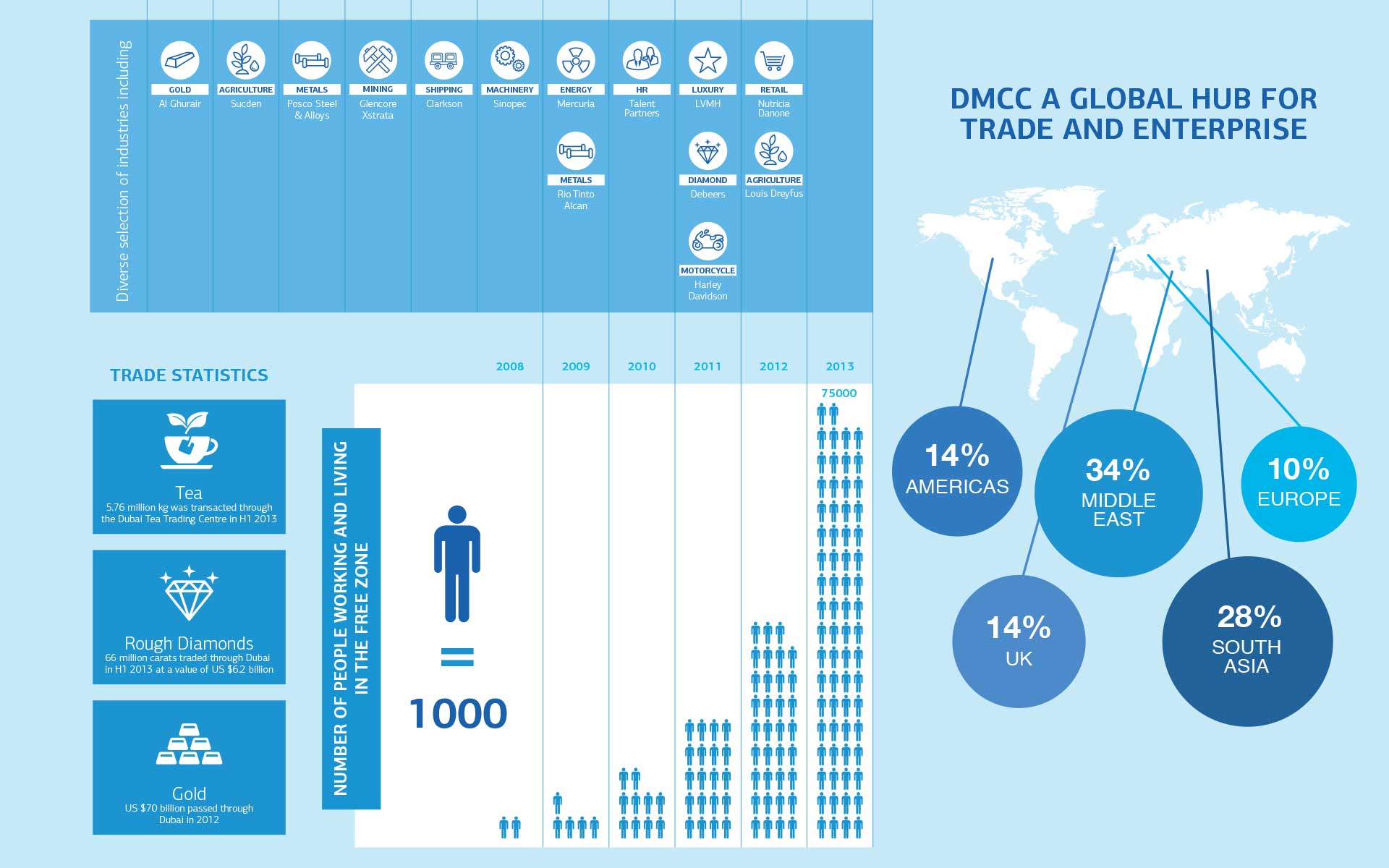
DMCC Infographic
Work done for MullenLowe DubaiDesign | Information Design
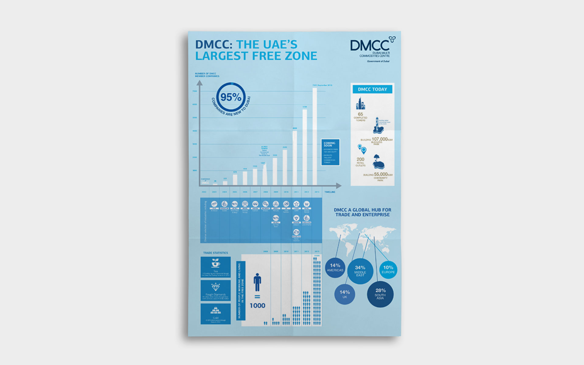
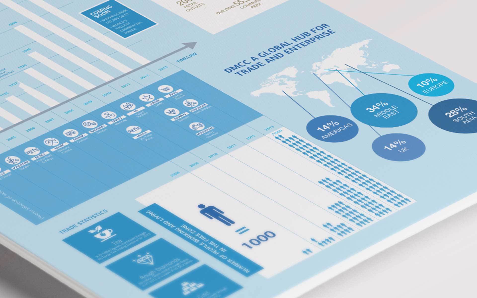
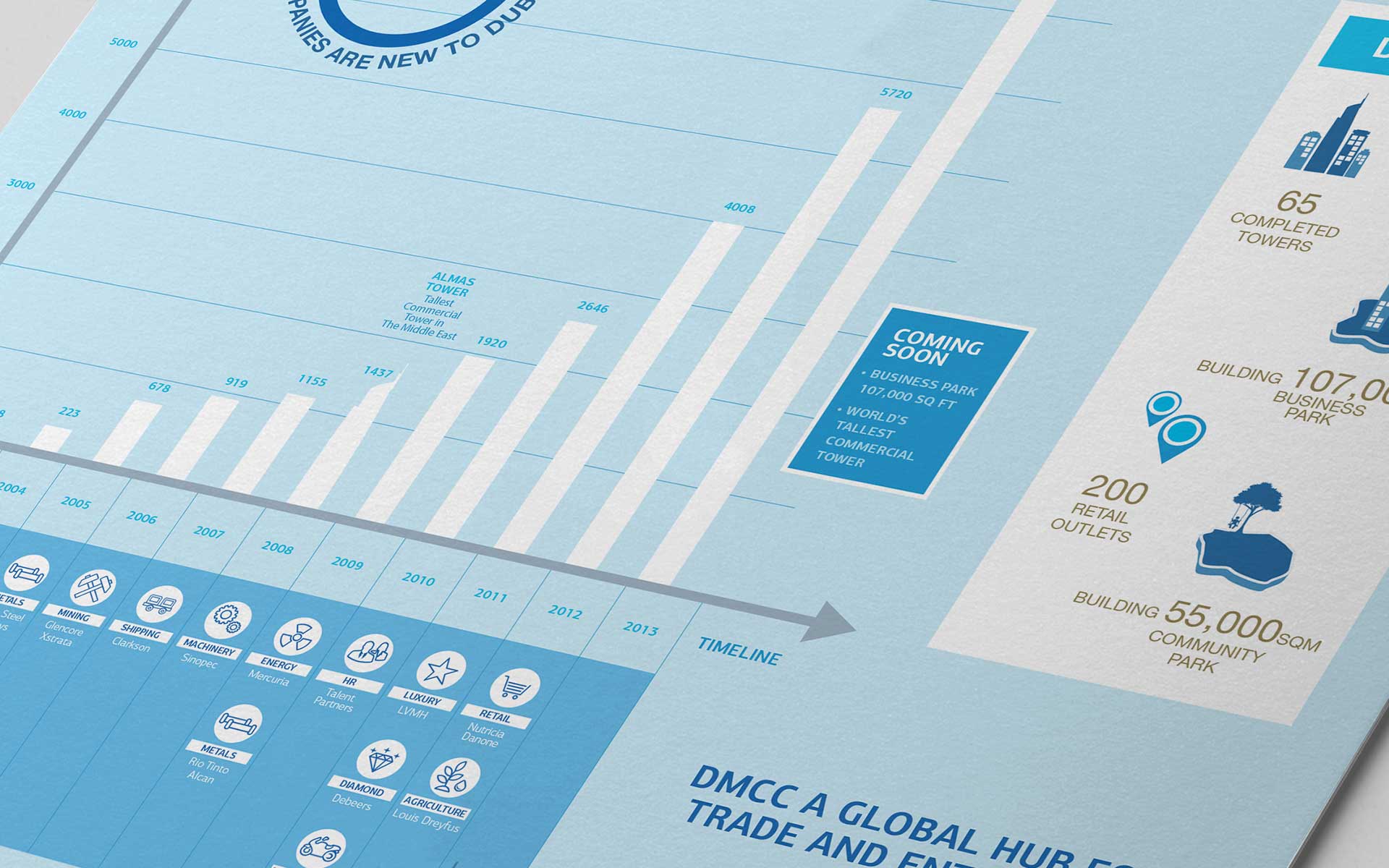
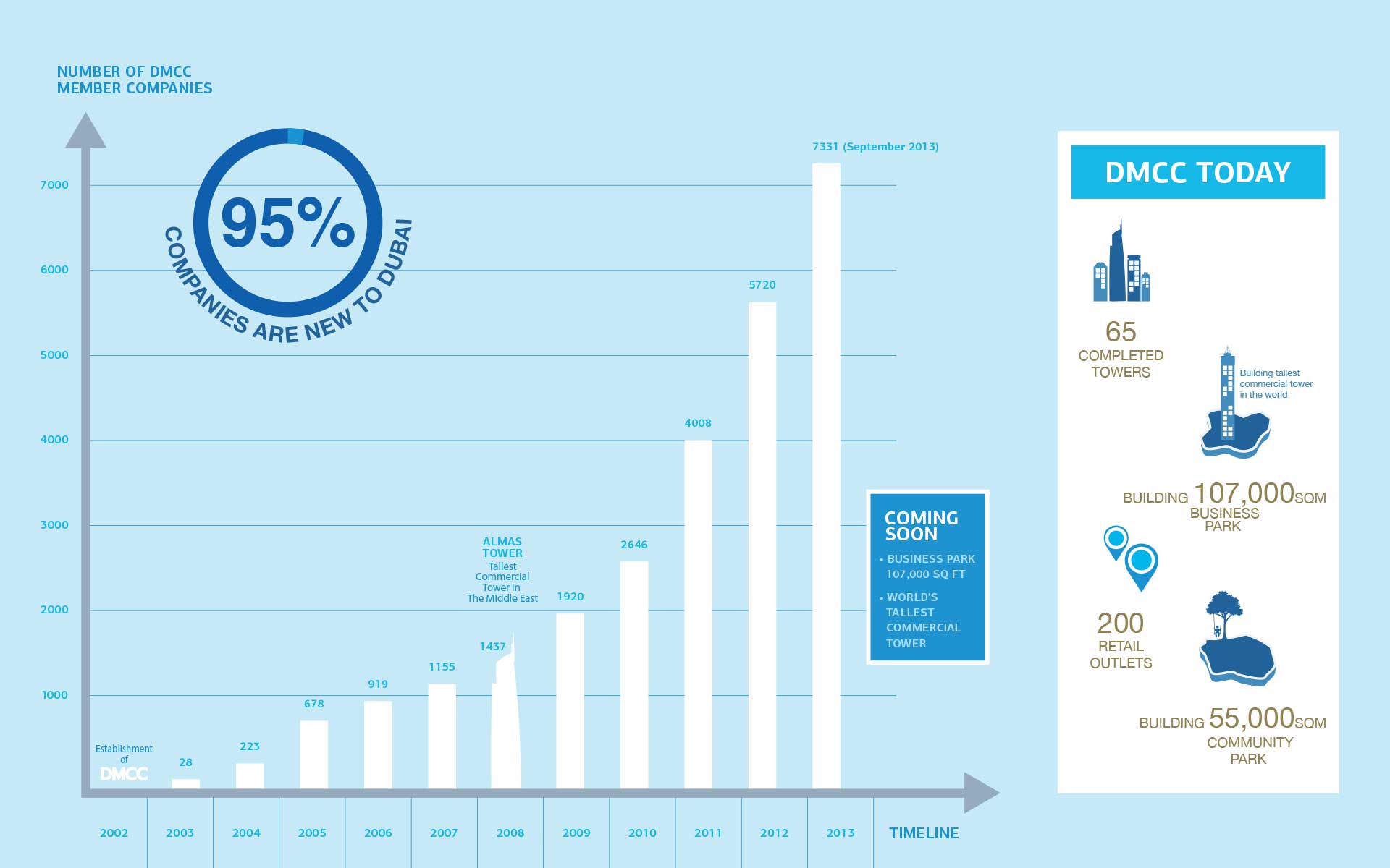
DMCC wanted to showcase the number of facilities, companies, and people they cater to within their free zone, in a way that was accessible and engaging. Dozens of charts, PowerPoint presentations and Excel sheets had to be made intelligible.
After going through the data and simplifying it, I re-structured it in a way that was easily followed. Using different visualization methods such as iconography, graphs, and tables, the information was re-designed with clarity in mind, and reflected the brand’s look and feel.

